All Posts in Product Owner

February 6, 2020 - No Comments!

Addressing Design Feedback: How to Keep Your Project Moving Forward

Seeing the visual direction for your edTech product for the first time is nerve-wracking. After all, you have a lot riding on the appeal of your product. And you just invested major time and resources in the development and design process.

Hopefully you love what your UX/UI team created as soon as you see it. More often, it takes many conversations to arrive at a design sweet spot.

Whether you're pleased or baffled by the initial design pass, years of experience have taught us how to present UX design effectively and keep a project moving forward.

Here are five common responses to visual design we encounter every day, and how we help our clients stay on track.

1. "Will our users really go for this?"

In edTech, you design for multiple audiences, from students and teachers to school administrators. Each of these audiences expects something different from a product's visual design. However, it's common for a product's stakeholders to have difficulty seeing how user expectations are being met through design.

That's why Backpack Interactive spends so much time during the UX planning phase getting to know your users. By the time we get to the visual design phase, we understand what kind of experience your user base expects when they power up a product. We know which tools your users interact with and whether they look similar to the one you're already building.

When we worked with WNET on their Mission US game platform, we presented a sophisticated design for middle and high school students. Mission US is a complex storytelling game that invites students to choose their own first-person adventure during famous moments in U.S. history. Mission US has stunning visuals and encourages complex decision-making, which makes it a compelling learning tools for students.
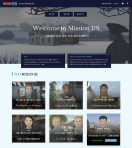
We researched other first-person games students play and love, and our findings impacted layout and design features for the site. For example, a video trailer that previews the game draws students in. It's not a typical design move for edTech, but we knew the game's cutting-edge visuals would speak to students using WNET's resources.

When we explained these decisions to our client in the first visual design meeting, it gave us the opportunity to tie important design choices back to the project's original goals. For example, we wanted to ensure that students knew where to go and what to do to begin each game. This priority was reflected in our design choices, layout, and call to action placement. We also decided to change the original design to make teaching and educational resources equally as important as gameplay. Educational content is now a main feature of the site and is easy for teachers to locate, preview, and interact with.

By conducting extensive user research and linking design choices to strategic goals, we help stakeholders understand what their users expect from a high-quality edTech product.

2. "I don't know what this is."

Have you ever been thrown by a wireframe or a user journey when you look at early product mock-ups? You're not alone.

Some of the best tools for understanding design features are the product's initial wireframes. Wireframes are like the blueprints for a house. They don't reveal everything about visual design, but they will give you and your stakeholders a sense of visual placement and important user interactions.

It's also our job to help you visualize things you can't see at work this early in the process. During the initial visual design presentation, we narrate all the interactions we can't show in 2D, like digital animations or hover properties. These are all the interactions your users will find engaging and delightful, but simply don't translate to 2D design.

We always encourage our clients to ask questions at this stage, too. When you feel empowered to ask questions, there is less confusion all around. Clear communication ensures that you have all the information you need to make the best decisions about your product.

3. "Should we add…"

It's common to get all the way through the UX planning and visual presentation phase only to feel as though you should add more features to your product.

Sometimes the urge to add new features means we haven't yet uncovered the primary goal of your product. More often, though, it's a sign that we might be trying to solve a UX problem through design — and that makes everything more complicated.

That's when we go back to the wireframes. We really want our clients to understand the structure and hierarchy of their product, so we make complex decisions about product features together.

But we also want to educate our clients about the most effective ways to design a menu or a data dashboard. Complex features like data dashboards grow and change over time. We always show clients major design features like dashboards in their beginning state, as well as how that feature will change as users generate data. When you give users just what they need, instead of everything they might want at once, you avoid visual overload and make your product even easier to use.

4. "This approach just doesn't feel right."

It's not always easy to explain why you don't like visual design. Sometimes it really comes down to a feeling or a preference. So how do you communicate more effectively about this with your design team?

This is when we start asking more specific questions about what you want to see and use "deep listening" to fuel our responses to feedback. What about the approach doesn't feel right? What will your users expect when they open this product? What's your goal for the user at this particular part of their journey?

The more we can uncover about which goal isn't being reached by a visual design, the more we can delve into user experience to deliver a solution that really works.

We'll also work hard to tell you which design decisions were based in best practices and which are backed up by data. With surveys and user stories driving the conversation, we get to the heart of the matter while ensuring that everyone on your team is heard.

5. "I like it, but I'm not sure my boss will."

It's especially important for stakeholders to participate in design presentations. Not only does a presentation reinforce your planning and decision-making, but it also creates buy-in from every member of your team — including your supervisor.

The visual design presentation is also an opportunity to take our clients through the decision-making process from top to bottom. We tie design decisions directly to UX planning and user pathways, so stakeholders can better understand how each decision in the UX planning phase reflects user expectations. We want to make sure you remember how we arrived at each UX and design decision together.

Visual design presentations are the result of a long, collaborative process. Remember: we're here to make you look good! Design presentations reflect all the careful decision-making and hard work you put in along the way. With the right preparation and execution, stakeholders will feel even more confident that you'll deliver an exceptional product users will love.

January 14, 2020 - No Comments!

How to Incorporate SEL into any edTech Product

Over the past decade, the education world has embraced the idea that respect, social awareness, and relationship skills are integral to a student's success in school.

These qualities are fundamental to a student's social-emotional learning, or SEL. After all, data shows that when a student doesn't have to worry about bullying or knows how to manage the pressure of taking a final exam, their ability to learn and retain new information improves.

edTech has zeroed in on this trend, too. There are now a slew of digital products that offer SEL teaching strategies and improve students' SEL. But if we want to be truly inclusive edTech designers, we can incorporate SEL features into any product—not just ones that are designed specifically to teach social-emotional skills.

This forward-thinking, equitable approach to product design bolsters student engagement, creates more effective learning tools, and addresses customer pain points in a more seamless way.

SEL Design Strategies: How SEL Concepts Map onto Product Features

According to The Collaborative for Academic, Social, and Emotional Learning, or CASEL, social-emotional learning can be defined by how a student develops the following attributes:

  • Self-awareness
  • Self-management
  • Social awareness
  • Relationship skills
  • And responsible decision-making

Teachers incorporate classroom activities that promote student growth in these areas all the time, from peer feedback activities to group projects to reflection prompts. Crucially, curricular activities designed to bolster SEL aren't just taught in isolation. SEL strategies are often incorporated into lessons on any subject, from math to reading to life sciences.

EdTech can draw on this framework, too. By using product features that promote collaboration, community-building, and creative problem-solving, we transform an edTech tool dedicated to subject-area content into a more comprehensive learning opportunity.

SEL techniques deliver more robust outcomes from any edTech application, as well as higher engagement from students. But digital tools with SEL features do more than help students tackle and retain new concepts. These features promote growth through process skills, communication, and collaboration.

For example, if you're designing a math or physics learning tool, consider incorporating ways for students to visualize, model, or sort data. By giving students multiple ways to analyze and solve a problem, you allow them to apply lesson content in broader contexts. They might even arrive at more unexpected—and brilliant—solutions.

In addition to promoting process skills, products with SEL features have the ability to address how users feel about difficult subjects like math and reading. When we research, design, and test with SEL strategies in mind, our products become more understanding of students' needs—and more useful to the teachers and students we serve.

Uncovering the Right SEL Features Through User Testing

It's an edTech designer's job to understand the emotional mindset of their user, a process often clarified by user testing and research. When you conduct initial research on users, you learn crucial information about their pain points as they try to accomplish tasks within your software.

This stage of the design process also offers opportunities to research and test the SEL components of your digital learning product. How do your users feel about math or reading in general? What's their preferred learning style? Can you uncover the way students think about math concepts? How might they communicate those concepts to someone like an instructor or a peer?

By researching the emotional mindset of your users during product testing, you can more effectively pinpoint what motivates students to learn. You'll gain insights into a student's emotional stumbling blocks around a subject. You'll also learn more about how students communicate with one another and with their instructors.

These interactions are also valuable to capture in testing environments because they help UX teams understand the complex mechanics behind collaborative group projects. Your UX team will be better positioned to design reflective or multi-step workflows that facilitate group learning in a digital format.

The more you learn about emotional mindsets and group dynamics during the testing process, the easier it will be to incorporate meaningful SEL features into your product. No matter what subject area your product happens to be in, SEL features immediately add value to students and instructors alike.

Learning tools that provide SEL strategies for students build engagement, efficacy, and delight in learning. They also give teachers a better understanding of how their students explain complex ideas and process complicated tasks.

Wondering how to translate SEL concepts into effective product features that students and teachers will love? We've got you covered.

December 19, 2019 - No Comments!

7 Best Practices for Testing Digital Products in Schools

User testing is exciting. You finally get to see your edTech product at work as 25 little people in a classroom begin pushing all the buttons on your product at once.

Testing digital products in schools also presents a number of challenges for product designers.

For example, there might not be enough time in your schedule—or enough wiggle room in your budget—to make substantive changes.

Or the questions developed by your UX team might gently color a user's experience of your product, giving you inaccurate data about how new users engage with each feature.

Set your team up for success by thinking through user testing in schools from the very beginning of the process. Here's how we design user testing to get to the heart of your users in their every-day environment.

User Testing in Schools: Getting to the Heart of Your Users in their Environment

  1. Develop the right mindset. You've already tested your prototypes. You've iterated your product along the way. You've even road-tested it with users. By the time you're ready to test in schools, you might think there are no surprises left. But that's where your mindset can shift. The point of user testing is to discover the many unexpected ways users will interact with your product. It's important to remain open-minded to the possibility of change, even late in the game. After all, small changes in your UX can create a much better experience for your users.

  2. Build design changes into your schedule and budget. To get the most value out of testing, incorporate design changes into your schedule and budget. Be clear with your team about the differences between cosmetic changes that won't impact a product's success and changes that will make a lasting, positive impact on your user's experience. Use all the feedback you receive from testing to improve your product's UX in substantive ways.

  3. Choose a true sample of users.Testing reveals how the average user learns to engage with your product in real time. For the data to be most effective, strike a balance between testing internal and external users. Internal users will give you important insights into how the product should work in an ideal world. External users, especially those who aren't tech savvy, reveal what might be confusing or unexpected about your product.

  4. Identify specific microflows that are essential to the product. At this point, it's probably been awhile since you thought about how students and teachers log in to your product. Or how teachers create a new class. Or how students engage with their peers on your platform. Think through the microflows that are most meaningful in each user journey and focus your attention there during testing. What did students have difficulty doing? What features confused or excited them?

  5. Concentrate on functionality. Help your users focus on functionality by incorporating clickable wireframes and other prototyping into your testing process. Wireframes eliminate any potential distractions created by visual design and allow users to really think about how a product works. Screensharing and heatmapping tools also help you see where users are directing their mouse. Are they wandering around on screen? Skipping over the login button because they expect it to be located in a different corner of their monitor? Be open to changing visual designs based on what you see after testing functionality first.

  6. Design open-ended questions. If you "lead the witness" in user testing, you're not going to get a real answer about your product. Open-ended questions allow you to dig into responses and discover whether users are getting what they should out of your product.

  7. Understand — and prepare for — the school environment. It's good practice for both product owners and the UX team to be in the room when users test products. This is especially true in school environments, which might have outdated hardware or bad internet connections. These hurdles are easy to forget in the comforts of your own office. The technology available in schools will also affect your testing outcomes. Make your product as lightweight as possible and scale it for the ChromeBook, which is commonly used in schools. Observe how the school environment impacts the ways your users interact with the product. Were there any unexpected stumbling blocks that might impact your UX or UI?

Done right, user testing reveals how your product will help students learn a new concept or guide teachers to create detailed reports about their classrooms. This crucial process also reveals where you can still improve the UX and UI in meaningful ways for your users.

Time and again, we've seen how a thoughtful, data-driven user testing process affects final product design in surprising ways. With these best practices in place, you'll be ready to tackle user testing for any edTech product and give your users exactly what they need.

December 11, 2019 - No Comments!

Visual Design Strategy: How to Make Stunning edTech Products Users Will Love

Strong visual design strategy is crucial for creating an effective edTech product that engages your users and helps learners understand new concepts. The right visual design also helps adult learners develop new skills and teachers make better decisions about what's happening in their classrooms.

But the visual design process can be difficult for stakeholders in edTech to understand. Often the emphasis is on an edTech product's functionality instead of its visual design. That's why you'll see a lot of clunky interfaces that look more like the administrative back-end of a website.

If you want to ensure adoption and efficacy, it's crucial to aim for the polished UI of a high-end consumer product that delights users as they learn new content or practice new skills.

Want to know the secrets behind our award-winning visual design? We'll show you how we design lively, engaging, and sleek educational technology and give you the tools you need to make a case for investing in visual design strategy for your next digital product.

Who Are You Designing For? Balancing Design Elements Between Teacher and Student Personas

edTech products are used by multiple personas, each with incredibly different visual design needs and expectations. At Backpack, we juggle competing persona expectations by considering which elements of visual design personas might share.

For example, if the student-facing side of your product fails to engage users with visual design, it'll be difficult for your marketing team to sell teachers and administrators on the effectiveness of your product. And if the teacher-facing side of your product feels too juvenile, teachers won't think it's a valuable or appropriate tool for them to use, either.

We use the visual design process to uncover where design elements from the student-facing side of a product meets the teacher-facing side of a product. Because teachers rely on edTech tools for assessing classroom data, they require a robust interface. Our visual design can be friendlier, striking a balance between "welcoming" and "professional." By drawing on visual elements from the student-facing side of the product, we help teachers feel like they're using the same product — without feeling like we're "dumbing down" an important technical feature.

Ultimately, a product's visual style should be strategic and grow out of the research you conduct in the UX phase as you determine your target personas. Without an effective visual design strategy that appeases all of your users, your product might never leave the shelf.

Case Study: How Our Visual Design Strategy Helped Teachers Look Like Data Experts

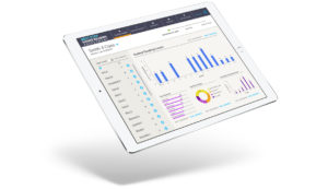
Good visual design explains complex ideas and brings them into focus for teachers and learners alike. This principle is especially true in our visual design strategy for Scholastic's NSGRA, or the Next Step Guided Reading Assessment.

The NSGRA is a teacher- and administrator-facing product. Throughout the visual design process, we considered how to balance the technical needs of this persona with emotional appeals to an educator's professionalism and warmth.

While many of the basic colors used in the visual design for NSGRA are neutral and understated, the product also features bright, optimistic color accents that call the user's attention to key data and action items. These saturated colors are used sparingly and with great purpose, and the overall effect is professional and clear while remaining friendly and accessible.

The NSGRA doesn't feel like a kids' product, and our visual design incorporates these warm, inviting colors for a softer visual style than other products designed to collect and analyze student assessment data. Even the fonts we chose are rounded, which softens the "hard" nature of data visualization and makes the product feel more inviting to use.

If we had pursued a visual style that was too friendly or soft, however, we might have made it difficult for teachers to appear like experts in meetings with parents or administrators. The purpose of NSGRA is to provide teachers with robust assessment and reporting tools. Printouts or presentations of classroom data need to retain a high level of visual credibility, so teachers can use data in meetings with administrators or parents without worrying that the design looks juvenile or untrustworthy.

On the other hand, if we had designed a powerful digital data management tool like the NSGRA to focus on raw data fields and reports, the visual result could have intimidated new users and limited sales.

Through the process of identifying the teacher persona's needs and analyzing use cases, we were able to strike the right balance in our visual design strategy. The NSGRA gives teachers the right tools — and the right visual aids — to successfully present student data and make a case for better student outcomes.

Smart Visual Design for Students: Delight Instead of Drudgery

edTech designers are competing for students' attention with slick, consumer app interfaces and heavily illustrated, 3D-animated games that have high-end storytelling and use immersive technology. The bar for visual design in student-facing edTech products is just as high.

Even well-intentioned visual design for learners can inadvertently cue students into the fact that they'll be completing a boring task instead of embarking on an interesting learning experience.

If your visual design conveys to learners that they'll have a delightful, high-quality experience, your edTech product is far more likely to engage students, pull them in, and compel them to interact with your content.

Collaborative Planning: Using Commercial Appeal to Teach

Earlier this year, we were asked by the Scholastic National Partnerships team to help develop an immersive learning experience for LEGO that celebrated the 50th anniversary of the Lunar Landing in 1969.

The result is a highly visual set of activities that blends creative gameplay and real information about science. Users play an introductory game called "Assemble Your Team" that uses narrative to teach them about real careers in the sciences. They also collect stamps on a passport as they complete missions with real-world obstacles.

But none of these highly visual, interactive games would have been created without facilitating a collaborative visual design planning process. In just six weeks, our technology team was able to innovate right alongside our design team to eliminate technical obstacles and increase user engagement.

Through working meetings, we designed activities in concert with the tech team that accomplished LEGO's goals for user engagement and education — without letting a compressed timeframe get in the way of visual appeal or technical demands.

Because of time constraints, we couldn't build a user database on the back-end to save profiles of students beyond their session. But we still wanted students to have a fun, rewarding experience. So we designed a version of every possible outcome on the front-end and handed them off to our developers. This was only possible because we could brainstorm with developers and problem-solve together in real time.

Solving the Right Problems: How a Smart UX Planning Phase Sets Visual Designers Up for Success

As a UX firm with a strong background in visual design, Backpack's UX planning phase is a crucial part of our design process. This was especially true for our client Learning Ally as we designed the look and feel of their audiobook solution.

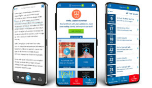
Learning Ally's audiobook solution app has three sections: a library of books to browse, a user community, and helpful resources and tools for struggling readers. During the planning process, we decided it was most important that users understand where they are within the app. We chose accent colors accordingly. The bright, orangey-red — only used once in our design — tells users whether they're in the library, community, or resource section of the app.

Our secondary bright color, a saturated green, highlights what we want users to do. It tells users what they can and should click on and where they can travel within the app. Everything else on the app screen is tonal. There's lots of blue, a Learning Ally brand color, as well as plenty of white space. More white space in design prevents cognitive overload in users, and it also draws attention to key accent colors and gives those colors more significance within the design.

Every design decision we made followed through on the strategic process of the UX planning phase. By building clickable prototypes for the app, we helped project stakeholders understand visual placement and functionality of its features. Once we began the visual design process, we had an excellent understanding of what the user's journey through the audiobook app would look and feel like. This meant we could design an interface that delivered on that experience.

Align Your Visual and UX Design for a More Powerful edTech Product

High-end design doesn't have to be a budget-breaker in edTech. Visual design is a strategic aspect of product planning, and successful edTech designers tie visual elements into the learning goals of each product.

When visual designers are cued into the needs of the UX team or front-end developers, you also create opportunities for creative problem solving that results in better customer engagement — and a stronger marketing platform down the line.

Companies that allocate resources for high-quality visual design from the beginning of the product planning process are more likely to design successful learning tools that test well with users. After all, if your sales team doesn't have to explain the visual appeal of a product, your product automatically generates trust and excitement — just by looking great.