All Posts in Product Owner

June 18, 2020 - No Comments!

Parents Are edTech’s Next Big Users

We were 10 minutes into a Zoom call with my 13-year-old daughter's school when her teacher asked us for feedback on their remote learning efforts. Even though I've been actively involved in my daughter's education, it wasn't until afterward that I reflected on how different it felt to be asked my opinion about the way in which she was being taught through technology.

As someone who's spent their career working in edTech, I could have critiqued the digital platforms her school chose, or suggested her teachers use even more of the amazing learning content I know is out there. But most of my feedback was about how to leverage technology to build more powerful social interactions between my daughter, her teacher, and her peers. How to go beyond Zoom calls and video lectures to find tools that foster authentic team dynamics, promote critical thinking in a social context, and allow for digital citizenship. At the end of the day, my daughter was still getting more out of her relationships with her teacher and her peers than any one edTech tool.

As we ended the call, I saw heads nodding. I felt heard. In the eyes of the school, I had switched from occasional IT help for my daughter to an authority figure on future technology decisions. I realized that my role as a parent could have a real influence not only on what technology platforms the school might adopt in the future, but also the ways in which those tools might be used.

These same kinds of conversations are happening all across the country. Suddenly, parents are poised to become edTech's next big user group.

Parents and Technology: How to Reconsider Parent Personas in the Age of At-Home Learning

If you've always thought of your buyer as a school administrator, the realities of the COVID-19 pandemic are likely making you reconsider your product's audience. As more parents take on the role of an at-home educator, they have also become potential buyers of learning technology. This makes parents new — and non-traditional — edTech influencers.

Parents who are deeply involved in their child's education care about the technology teachers utilize in their at-home learning plans. They want to know how specific edTech tools work and which ones fit their child's needs. Parents are also savvy enough to lobby for technology designed to teach their children 21st-century skills. They want their children to cultivate an early love of reading, become better writers, and learn how to coordinate on team projects. They'll look for the right learning tools to supplement their child's instruction in order to make that happen.

We also expect parents to become stronger advocates for specific learning tools, which have become part of the overall experience of at-home learning. As parents seek out and share the best solutions for at-home learning with one another, parent networks have become non-traditional edTech influencers.

This sea-change in edTech's target markets will likely affect your marketing team's efforts first. As teams determine which product features resonate with parents juggling at-home learning with work-from-home tasks, messaging will shift. But how should you rethink feature design, or upgrade your existing products, to meet the new needs of parents?

Here are four areas where you can focus your attention and meet the needs of edTech's next big user — parents.

Emphasize Family Communication Features

Our research indicates that much of learning happens in the context of strong student-teacher relationships. Unfortunately, the new structures of at-home learning have drastically challenged those relationships. Email, messaging, and video calls just don't build strong teacher-student relationships in the way that real one-to-one time in the classroom does.

In order to help teachers maintain their voice, infuse their personality, and remain effective educators, the communication features in your product need to drive engagement for students and families. How many different ways can you introduce interactivity within your product? How do your communication features help teachers create clear expectations for both learners and family members?

At-home learning requires a lot of flexibility from teachers, parents, and students. In order for products to offer users this flexibility, interactive features should be as conversational as possible. Teachers need feedback, parents need to be heard, and students need clear pathways to assignments and other teacher-student or student-student interactions. Conversational features are also at the heart of SEL learning techniques and can further strengthen relationships between parents and teachers.

Here are a few conversational family communication features to consider:

  • Open message boards
  • Threaded discussion streams for assignments
  • Office hours for one-to-one instruction or parent-student discussions
  • Quick, lightweight responses, like emojis or social media-esque interactions
  • Dynamic sharing features

The more edTech products iterate on family communications features at the platform level, the easier it will be to serve the needs of all your users — including parents.

Revisit Onboarding and Integration Needs for Your Products

You may already be used to designing different onboarding experiences for different users. Teachers, for example, may not be as technologically savvy as young students, who have a different facility with software. Now, you'll need to revisit your onboarding and integration needs to address the parent persona, too.

Most often, students are the end users of edTech products, and parents serve as a facilitator user — the user who helps set up accounts and profiles for your student persona. Parent personas may lack the pedagogical context teachers have come to expect from products, but at-home learning means parents now need that information, too.

Given the parent persona's role in facilitating student interaction, your onboarding process can provide even more context for how your product fits into the curriculum and how it can be used as a tool for student learning. Your product may integrate with Google Classroom, SeeSaw, or other popular edTech platforms. If so, help your parent persona understand what those integrations are, how they work, and why you've included them.

Here are a few other solutions to consider:

  • Leverage common UX patterns to help parents understand how your product works
  • Borrow from the vocabulary of the classroom to clarify user interactions ( consider, for example, phrases like, "turn the work in" or "share" vs. "mark as complete")
  • Consider the full constellation of learning software your users depend on
  • Design using a single sign-on whenever possible

Remember: your product doesn't have to be everything to everyone. In fact, when you avoid designing proprietary platforms for existing solutions, like word processing and file-sharing, your tool becomes more useful for teachers and parents.

Now is the perfect time to revisit whether parent personas have the right context for understanding your tool — and how you can help them navigate common challenges within your software. The more you improve the UX of your product, the more you'll be able to address the concerns of this emerging stakeholder persona.

Embrace Mobile-Ready Design

Even if students have their own desktop to complete school work at home, their primary point-of-contact for most edTech software will be through a parent's mobile device.

Backpack's user research has shown both teachers and administrators rely heavily on mobile-ready software. There's enough anecdotal evidence to suggest parents and students have similar technology needs. Just as teachers want to plan for class or do professional development on their phones, parents may want or need to watch help videos about your software or prepare for their day of at-home learning.

When parents are uncertain about how edTech tools work, it adds a layer of frustration or apprehension for students who are already experiencing heightened emotions during at-home learning. Mobile-ready designs with developed parent personas give parents more flexibility as they preview lessons or prepare for helping their children navigate tasks.

You could also consider:

  • Allowing parent personas to preview or pre-use your tools in order to explain tasks and teacher expectations to their children
  • Introducing planning tools or video content aimed specifically at parents
  • Ensuring family communications tools are optimized for mobile experiences
  • Designing with asynchronous at-home learning and work-from-home schedules in mind
  • Making mobile-ready software as robust as desktop software to ensure accessibility for all students

Ultimately, mobile-optimized design ensures better family communication, more flexibility for parents, and eliminates barriers to access for families who may not have desktops available for their students. As at-home learning continues, parents will expect — and advocate for — edTech solutions that are easy to use on multiple devices.

Eliminate Barriers to Access

Our user research has shown that even tech-savvy parents are lost as they attempt to navigate Google Classroom and other online learning platforms. Even well-designed products can make it unintentionally difficult for parents and students to read and submit assignments in one place. When points of interaction are disconnected from source material or assignments, confusion reigns.

We believe that edTech has a responsibility to improve UX whenever possible. Now is the time to survey users and re-evaluate your product's ease-of-use for personas who don't have a background in tech. Whether or not it's fair, a parent's negative experience with technology may reflect on a teacher's ability to use tech effectively.

Other common barriers to access include:

  • Unreliable internet
  • Manual saving functions
  • High-res designs
  • Desktop-only design

To ensure ease-of-use, consider adding functions like autosave to prevent the loss of information or working offline to allow users to make progress if their internet blips out. Take extra steps to ensure that users can easily differentiate between accounts, since parents may have multiple children signed into one computer or device.

Are You Ready to Roll Out edTech Tools to Parents?

The time of the parent persona is here! It's up to us to design the best experiences possible for our newest power-user — and improve UX for tools that facilitate learning beyond the classroom.

Even though uncertainties about at-home learning remain, we expect to see parents continue to influence the kinds of software schools use and adopt. At-home learning has made parents even more fluent in the kinds of features that make products work outside of the classroom. This new knowledge will translate into more advocacy for software that addresses specific student needs, too.

Schools and administrative buyers will also want to better understand the parent persona as they navigate licensing decisions for at-home learning. They'll look to edTech companies to identify learning software that checks all the boxes.

Does yours?

May 15, 2020 - No Comments!

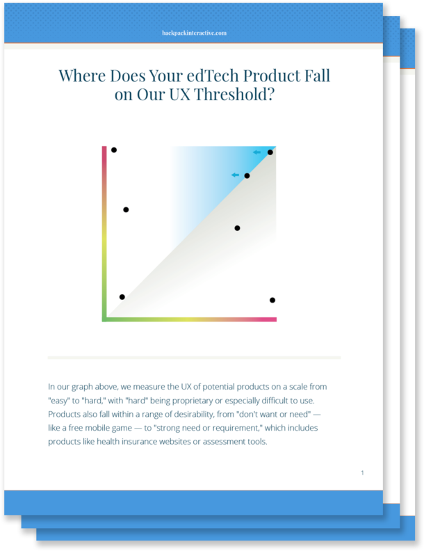
Where Does Your edTech Product Fall on the UX Threshold?

If you've ever tried to sign your child up for a PlayStation or Nintendo Switch account, you know how complicated digital experiences can be. When it comes to popular gaming sites, most tech-savvy parents are willing to put up with less-than-ideal UX just to make their children happy.

For every digital experience, there's a UX threshold. When the digital experience is so frustrating that the user no longer finds value in the product, the brand has pushed too aggressively against the limits of the UX threshold.

Some brands with particularly loyal users might be "lucky" enough to stop investing in better UX. But if a company has decided that its profitable threshold allows for a poor UX, do they have any obligation to improve? Beyond lost revenue, is there ever a moral obligation to make their products more user-friendly?

If you're designing edTech products, the point at which your user becomes frustrated or stymied by a complicated UX is even more important to gauge. After all, whether you're working for a nonprofit company or a well-established educational brand, good UX in edTech becomes an issue of access and equity.

Your users need products to pass a class, learn a critical skill, or pass a standardized test in order to attend college. What happens if a teacher experiences a high level of frustration when trying to use your product in the classroom? Or your user is a parent who isn't technologically savvy? Or an administrator desperately needs your technology to improve outcomes for their school?

Because the stakes are so much higher in our industry, we should be motivated to design tools that do more than meet our bottom line. And that means the UX for even the most complex learning tools needs to be as streamlined and accessible as possible.

Ditching Highly Proprietary Design Patterns: Reducing the UX Threshold for Complex Administrative Tasks

It might be easy to improve on bad UX, but making good UX great requires complex problem-solving from your UX team.

In edTech, the administrative aspects of learning products often have the most technical complexity. By leveraging common UX patterns, you'll lower your UX threshold and make your product something that meets teachers and students where they are.

Administrative complexity looks different depending on your primary user. For teachers, administrative complexity may involve setting up the software for the learning product, creating user profiles, rostering students, or managing multiple staff users. For administrators and IT professionals, it might mean navigating multiple screens, connecting to outside systems, or learning how to share data across platforms. And for parents, administrative complexity requires learning how to sign up their child as the product's primary user. It might also mean taking advantage of available learning outcomes data in order to make informed decisions about their child's education.

In order to lower the UX threshold for your product, leverage existing UX patterns that won't require users to learn a new, proprietary system or go to multiple places to accomplish a simple task. Lowering your UX threshold encourages your user to engage with the task at hand, which leads to higher completion rates within your product. It also helps shift the user's mindset from tense to relaxed. A tense user will tend to have a lower frustration threshold for completing tasks.

Even if you're using well-established UX patterns, there's plenty you can do to provide a fresh and delightful experience for your user. Micro copywriting, visual design, and other touches provide your experience with a unique look and feel without causing cognitive overload.

The more you can do to meet schools, teachers, and students where they are, the more relevant your designs will be. You'll create learning products that solve problems and integrate with a teacher's day-to-day technology. And you'll design tools that enhance and extend what administrators are already using — all without adding complexity for your users.

Leveraging Interactive Complexity to Help Students Learn

In edTech, designing a product with interactive complexity becomes even more important. We have an obligation to consider how to make interactive teaching moments rather than static ones. We must strive to work with subject matter experts to determine how to break a topic down, so students work with material in a rich way.

Most learning products demand a high level of interactive complexity from UX designers. Ideally, students are able to learn new concepts or skills as they move through an experience and interact with it. However, this level of interactivity adds to a product's UX complexity, and UX designers often remove interactivity from the moment of instruction or assessment — just when students need it most.

For example, a learning product with interactive science experiments might have two separate interfaces. In one interface, students are introduced to scientific concepts illustrated by the science experiments. In another, they might be encouraged to interact with the science experiment itself.

However, if you separate the interactive interface from the problem students are trying to solve, you'll wind up creating a higher barrier to learning. You'll design a cognitively disjointed experience, which isn't how students experience learning in the real world. Students will end up learning how to use your product — instead of learning a new concept.

While it may seem counter-intuitive, leveraging interactive complexity actually requires you to simplify the UX for your product and reduce its UX threshold. The more you simplify your UX, the more likely you are to make a product that showcases important concepts and engages the students who need your product to learn.

The ROI of Investing in Great UX by Reducing Your UX Threshold

Even if you're building a complex product, there's real ROI to investing in UX. Not only do you help teachers, administrators, and parents onboard and navigate your product quickly, but you also improve learning for students by connecting new concepts and skills to interactive UX.

Concrete design requires both the administrative and interactive parts of a product to work together in concert, even when they're individually complex. When you use an approach like concrete design, you make a product that's more likely to be bought or adopted. Teachers and students respond to a product that's easier and more fun to use, increasing overall engagement with your product.

You also reduce cognitive load within the product, which means less training time for teachers and less onboarding for students. While onboarding for any product is necessary, there are downsides to a long, drawn-out adoption process. If your onboarding strategy depends too heavily on textual explanations, for example, you introduce more barriers to students and teachers with learning differences.

When you reduce training and onboarding needs for your product, not only are you building a more equitable product, but you're also shifting resource allocation within your budget. Suddenly, you don't have to spend a large chunk of your project budget on designing onboarding tools. Instead, you're able to focus those resources on developing product features and creating outstanding visual design.

When you build a tool that's more intuitive to use, you directly impact your bottom line. Improving UX leads to more revenue streams as you widen your market and roll out a product that's more accessible and easier to use. When you give potential clients a demonstration of your intuitive product, your sales team has to do less explaining — and the product begins to sell itself.

Why the edTech Industry Should Care About Making Good UX Even Better

Like you, we care about designing intuitive edTech products that solve real problems and are adopted widely by schools and school districts. But we also recognize that the edTech industry has different users and goals than consumer tech.

The stakes for edTech products are much higher. Good UX can be the difference between a student learning a new concept and struggling to master it. It can also mean the difference between a product that all students can use and a product that excludes students with learning disabilities.

Because the stakes for our products are so high, we have a moral obligation to identify the point at which bad UX creates barriers to success — and push ourselves to make good UX even better.

March 3, 2020 - No Comments!

Who Are We Making Our Products For? Designing across unique edTech personas.

There's plenty you already know about the basic needs and wants of your edTech audience. Teachers want tools that make their jobs easier. Administrators crave products with strong efficacy data. And students want learning tools that engage and delight, as well as instruct.

Unlike commercial applications, however, edTech software is not always used by the same people who make purchasing decisions. This makes designing an edTech product a special kind of challenge. Products often have multiple users with very different personas, like experiences meant for both teachers and students. But what happens if you put most of your resources into the student experience, leaving little time or money to create a delightful teacher experience, too? Budgets and turn-around times are real constraints for product teams, and these constraints can have an outsized effect on whether or not your product actually gets adopted in schools.

User Experience Research, or UXR, is the key to unlocking the primary user of your product without losing valuable time or resources. But in user-centered design for edTech, you can't just stop there. You have to understand the user's entire ecosystem, too. How is a teacher actually using your product in their classroom? Who are they thinking about as they enter student data or generate reports? Who's the next person they'll talk to about your product's output or analytics?

We spent some time chatting with Jessica Millstone, former Director of Engagement & UX Researcher for BrainPOP, about how to use UXR to narrow your edTech product design to specific user personas. Read on to discover the value of UXR as a preparatory lens for product design and learn how we use persona research to guide design conversations at Backpack.

[contentupgrade id="1011"]


How UXR guides edTech product design

User experience research is targeted quantitative and qualitative research that offers insights for both your product and your users. Because UXR moves you closer to achieving a specific product goal, you and your team should already know how you will apply UXR insights to your product when you begin the process.

"I think people know how important it is to collect real information about user needs," said Millstone. "But the rich, qualitative data product developers get from interviewing, surveying, and doing deep market research on their target audience comes with its own problem: volume and noise."

Strategic discussions about the primary user of your product cut down on the "volume and noise" of UXR. With so many different edTech personas in play, it's crucial to understand how your primary persona will interact with or serve other personas, from students to administrators to parents.

"The goal is to create a story, based on real data, about a person authentically using your product," Millstone adds. "The more specific the better! Personas are hands-down the best way to create a memorable imprint of your customer's needs that your team can connect with throughout the product design process."

Ultimately, a persona's environment and their specific audiences will resonate through the design decisions you make for the product itself. At Backpack, we call this effect "persona resonance," and we use it to identify the interactions between our primary persona and their audiences. UXR uncovers these interactions and helps us emphasize the right features for the right persona at the right time within your product.

For example, if you're working on a product that serves pre-K educators, you'll use a different tone within the product than you would in a product designed for high school or higher ed instructors. While you're still designing a product meant to be used by adults and educational experts, this persona's interactions with young students will affect the way you approach both product experience and design.

No matter what kind of edTech software you're designing, UXR and persona resonance can help you narrow your focus. When UXR and UX work hand-in-hand, your primary persona experiences the value of your product with every click or swipe.

Preparing for UXR the Backpack Way

At Backpack, we have a specific process for identifying the needs of a persona. Desk research is the foundational work that helps your UX team make each element of your UXR actionable, and that's where we always start.

Here's an outline of what we do before we ever talk to a user:

  • Make a plan for the outcome of each research element. Identify how UXR will help your team be more precise and tactical so you won't get distracted or go down a research rabbit hole. We always start with a rubric that allows us to test the actionability of our UXR.
  • Conduct a UX audit of your existing product. If you're redesigning a product, this is the time to analyze user data, site maps, and user journeys. Dissect the product's UX to create a road map for your next steps.
  • Complete a competitive audit. Where does this product fit into your edTech niche? Who's already built an experience like yours? This audit will also help you map the UX language of your market through the lens of user expectations. What kinds of words and experiences do users already expect from products like yours?
  • Administer quantitative user surveys. Establish a baseline for user data in order to develop more targeted qualitative questions. For example, how does demographic data, like years spent teaching or level of education, cross-reference with teacher technology usage? Interesting patterns will help you identify areas worthy of deeper investigation in the next phases of user research and testing.
  • Observe students and teachers in a real-time environment. It's crucial to have a UXR lens in place before you head out into the field. Purposeful in-person investigations lead to better insights about your personas and your product.

How UXR Helps You Showcase the Value of edTech Software

This discovery process takes anywhere from 4 weeks to 4 months. Within that time frame, Backpack narrows in on what your user needs and what's missing from the products they already use.

Because of UXR, we're able to pinpoint precise tactical recommendations that work for your specific persona. Without these insights, it's all too easy to lose the interest and investment of your user. The value proposition of your product simply won't be visible enough throughout your UX.

Value matters for every persona, whether you're designing for students, teachers, or administrators. Students need exciting ebooks and easier ways to access major texts. Teachers need to know their time isn't being wasted and that they'll look professional in front of supervisors and parents. Administrators need to know your products are effective and easy to use.

When you've conducted strong UXR, every moment of your product's experience is created in concert with that value proposition. UX, visual design, copywriting choices, and technology decisions will each make your product more relevant and even more delightful. Persona resonance will have a ripple effect on each of these decisions, too. Understanding the interactions our primary user will have with secondary users makes it even easier to unlock the nuances of your persona and design a product that's both useful and reassuring.

Amplify Case Study: When Parents Facilitate Student Learning at Home

In Amplify's "Mobile Solos" application, middle schoolers track reading assignments and take mini quizzes. Even though the tone and design of the product is friendly and easy for 7th and 8th graders to use, the application is made to feel like an assignment from a teacher. The design challenge for this product was to make middle schoolers take "Mobile Solos" seriously — without missing the mark in terms of age.

Mobile solos screens

These images show the Amplify mobile solos user interface designs.

We used persona resonance to address the needs of two secondary personas: administrators and parents. Administrators make the purchasing decision for "Mobile Solos" within their school or district, which means they're an important gatekeeper to the product's success. UXR revealed that admins are highly aware of the technology available to their students at school and at home. Because students often complete digital assignments on mobile devices, we optimized our UX for mobile before making suggestions about the desktop experience.

UXR also revealed that middle schoolers often interact with their parents to complete assignments in digital products or applications, especially on mobile devices. Your average middle schooler may not have their own smart phone. It's far more likely they will depend on their parent's device, especially if there are no computers at home.

This meant parents were a secondary audience for Amplify's "Mobile Solos." Many parents are used to helping their children with programs like Jump Rope, Canvas, and Google Classroom, which means they already have a set of expectations for how sophisticated edTech products should look and feel. "Mobile Solos" had to rise to meet those expectations — even though the product wasn't specifically designed with this persona as a primary audience.

When you design for edTech, you're never designing a product for just one persona. But conducting strong UXR, facilitating thoughtful discovery, and mapping persona resonance can result in a better, more focused product for your target persona.

Want to learn more or have something you’d like to add about designing for specific edTech audiences? Join Sean Oakes and Jessica Millstone at their SXSW EDU campfire on March 11, 2020 for a lively campfire discussion. Learn more here.

February 17, 2020 - No Comments!

What Are You Selling? UX Solutions for SaaS in edTech

When it comes to designing software-as-a-service, or SaaS, it can be difficult to decide where your marketing site ends and your product begins.

How do you create clear boundaries between the free and paid features for your product through UX and visual design? How do you communicate to your user the value of your SaaS without giving away the farm?

It might be tempting to only give users a small taste of your product's full capability. After all, you don't want to attract a bunch of hangers-on who never convert to paying customers!

However, we've found that the more you "give away" before asking users to convert, the better engagement you'll have with your product. That's because most users want to see and experience the value of your product in their own lives before committing to a paid model.

This can be true in edTech, too. For example, you might have more opportunities to convince teachers that your video lessons have value in their classrooms if you don't paywall all of your video content immediately. By letting teachers use more than one video and build lessons around your content, you'll be more likely to convert teachers into paying customers. You'll also have a better chance of transforming them into advocates for your product.

But, as edTech products become more complex, the "freemium model" for SaaS only gets you so far. If you're developing a product for teachers that collects outcomes and data, you'll need to consider even more carefully where your product's marketing experience ends — and when you've given away too much.

What Are You Selling? UX Solutions for edTech SaaS

A user's sales experience with SaaS is closely tied to their understanding of the product's experience and design. How does your product look and feel? Is it more powerful or easier to use than the product they're currently using? Good UX and visual design helps users build trust with your brand, even as they begin evaluating whether your product will solve their most pressing pain points.

Before you can attract new users to your product, your product and sales team will have to identify the SaaS model that gives away just the right amount of content. Here are the three most common UX solutions for SaaS and how you can align your edTech product goals with the right one.

    1. The "Freemium" Model
      Works great for:
      specialized course content
      There's a reason marketing departments love free trials — they work! High-quality free content teases visitors to integrate tools into their daily lives. Ultimately, you want the tool to be so valuable — and the content to be so effective — that your visitors convert into paying customers. For both free and paid subscriptions to thrive, your company must commit to continuously innovating you product. After all, attracting new potential customers gets harder as you go. Improving the free version of your edTech product will become just as important as developing the paid version when it comes to attracting and keeping new users. When our client SuperD!Ville launched their new site, we recommended including a "freemium" content area for new users. Their "Episodes" page now showcases a range of helpful video resources for teaching students social-emotional skills. One of the videos is free, and a subscription is required to access their other active learning tools. Even with access to limited content, SuperD!Ville users get a taste of how powerful the lessons are in their classrooms and begin to envision how they'll use additional, paid resources.


    1. Separate product and marketing sites
      Works great for:
      long-term, complex solutions like curricula or student assessments
      It's not easy for educators to determine whether an entire curriculum will work in their classroom or school district if they only have access to a product for 30 days. What truly convinces administrators in this case isn't free access — it's efficacy data. The best way to present this data is often by creating a separate marketing site that targets the decision-making administrator or educator persona. On your marketing site, present case studies that illustrate real-world ways your product has made a difference. Discuss how the product can be integrated into what teachers are already using. Provide testimonials from users and build a community of champions. Each of these tactics will make a persuasive case for why an administrator should adopt a curriculum or a specific student assessment. Leverage the early UX research you conducted to fine-tune which product features and data will be most compelling to this persona.


    1. Integrated SaaS solution
      Works great for:
      Data-driven tools, products with complexity and depth
      Integrated solutions give users a limited set of all features, but prompt users to unlock additional features by subscribing or paying a fee. From a marketing standpoint, you're showing off your best product features even as you help users learn how those features are integrated within the workflow of the product. Unlike other models, your conversion opportunity arrives at the most critical moment for your user — right when they want a deeper outcome or result from using the features of your product. Early in the planning and research process, you'll need to decide whether your product can be sold directly to teachers or school administrators. Are you providing an enterprise solution that has to be adopted at higher levels? Or are you providing individual teachers a powerful tool for their individual classroom?This may also affect the types of licenses your sales team will offer, as well as the different levels of features that could be unlocked within the product itself. Will you lead users strategically toward a rolled-up sale to gain access to a broader market? Foster collaboration between your UX team and the sales team early in the design process to create the best possible experience for your users.


User-centered approaches to edTech SaaS require a sophisticated approach to user research, product design, and marketing. The more your UX team collaborates with major stakeholders to identify the best experience for your users, the better your product's content, features, and sales experience will be.