
December 11, 2019 - No Comments!
Visual Design Strategy: How to Make Stunning edTech Products Users Will Love
Strong visual design strategy is crucial for creating an effective edTech product that engages your users and helps learners understand new concepts. The right visual design also helps adult learners develop new skills and teachers make better decisions about what's happening in their classrooms.
But the visual design process can be difficult for stakeholders in edTech to understand. Often the emphasis is on an edTech product's functionality instead of its visual design. That's why you'll see a lot of clunky interfaces that look more like the administrative back-end of a website.
If you want to ensure adoption and efficacy, it's crucial to aim for the polished UI of a high-end consumer product that delights users as they learn new content or practice new skills.
Want to know the secrets behind our award-winning visual design? We'll show you how we design lively, engaging, and sleek educational technology and give you the tools you need to make a case for investing in visual design strategy for your next digital product.
Who Are You Designing For? Balancing Design Elements Between Teacher and Student Personas
edTech products are used by multiple personas, each with incredibly different visual design needs and expectations. At Backpack, we juggle competing persona expectations by considering which elements of visual design personas might share.
For example, if the student-facing side of your product fails to engage users with visual design, it'll be difficult for your marketing team to sell teachers and administrators on the effectiveness of your product. And if the teacher-facing side of your product feels too juvenile, teachers won't think it's a valuable or appropriate tool for them to use, either.
We use the visual design process to uncover where design elements from the student-facing side of a product meets the teacher-facing side of a product. Because teachers rely on edTech tools for assessing classroom data, they require a robust interface. Our visual design can be friendlier, striking a balance between "welcoming" and "professional." By drawing on visual elements from the student-facing side of the product, we help teachers feel like they're using the same product — without feeling like we're "dumbing down" an important technical feature.
Ultimately, a product's visual style should be strategic and grow out of the research you conduct in the UX phase as you determine your target personas. Without an effective visual design strategy that appeases all of your users, your product might never leave the shelf.
Case Study: How Our Visual Design Strategy Helped Teachers Look Like Data Experts
Good visual design explains complex ideas and brings them into focus for teachers and learners alike. This principle is especially true in our visual design strategy for Scholastic's NSGRA, or the Next Step Guided Reading Assessment.
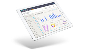
The NSGRA is a teacher- and administrator-facing product. Throughout the visual design process, we considered how to balance the technical needs of this persona with emotional appeals to an educator's professionalism and warmth.
While many of the basic colors used in the visual design for NSGRA are neutral and understated, the product also features bright, optimistic color accents that call the user's attention to key data and action items. These saturated colors are used sparingly and with great purpose, and the overall effect is professional and clear while remaining friendly and accessible.
The NSGRA doesn't feel like a kids' product, and our visual design incorporates these warm, inviting colors for a softer visual style than other products designed to collect and analyze student assessment data. Even the fonts we chose are rounded, which softens the "hard" nature of data visualization and makes the product feel more inviting to use.
If we had pursued a visual style that was too friendly or soft, however, we might have made it difficult for teachers to appear like experts in meetings with parents or administrators. The purpose of NSGRA is to provide teachers with robust assessment and reporting tools. Printouts or presentations of classroom data need to retain a high level of visual credibility, so teachers can use data in meetings with administrators or parents without worrying that the design looks juvenile or untrustworthy.
On the other hand, if we had designed a powerful digital data management tool like the NSGRA to focus on raw data fields and reports, the visual result could have intimidated new users and limited sales.
Through the process of identifying the teacher persona's needs and analyzing use cases, we were able to strike the right balance in our visual design strategy. The NSGRA gives teachers the right tools — and the right visual aids — to successfully present student data and make a case for better student outcomes.
Smart Visual Design for Students: Delight Instead of Drudgery
edTech designers are competing for students' attention with slick, consumer app interfaces and heavily illustrated, 3D-animated games that have high-end storytelling and use immersive technology. The bar for visual design in student-facing edTech products is just as high.
Even well-intentioned visual design for learners can inadvertently cue students into the fact that they'll be completing a boring task instead of embarking on an interesting learning experience.
If your visual design conveys to learners that they'll have a delightful, high-quality experience, your edTech product is far more likely to engage students, pull them in, and compel them to interact with your content.
Collaborative Planning: Using Commercial Appeal to Teach
Earlier this year, we were asked by the Scholastic National Partnerships team to help develop an immersive learning experience for LEGO that celebrated the 50th anniversary of the Lunar Landing in 1969.
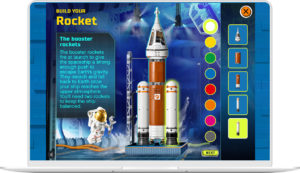
The result is a highly visual set of activities that blends creative gameplay and real information about science. Users play an introductory game called "Assemble Your Team" that uses narrative to teach them about real careers in the sciences. They also collect stamps on a passport as they complete missions with real-world obstacles.
But none of these highly visual, interactive games would have been created without facilitating a collaborative visual design planning process. In just six weeks, our technology team was able to innovate right alongside our design team to eliminate technical obstacles and increase user engagement.
Through working meetings, we designed activities in concert with the tech team that accomplished LEGO's goals for user engagement and education — without letting a compressed timeframe get in the way of visual appeal or technical demands.
Because of time constraints, we couldn't build a user database on the back-end to save profiles of students beyond their session. But we still wanted students to have a fun, rewarding experience. So we designed a version of every possible outcome on the front-end and handed them off to our developers. This was only possible because we could brainstorm with developers and problem-solve together in real time.
Solving the Right Problems: How a Smart UX Planning Phase Sets Visual Designers Up for Success
As a UX firm with a strong background in visual design, Backpack's UX planning phase is a crucial part of our design process. This was especially true for our client Learning Ally as we designed the look and feel of their audiobook solution.
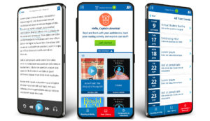
Learning Ally's audiobook solution app has three sections: a library of books to browse, a user community, and helpful resources and tools for struggling readers. During the planning process, we decided it was most important that users understand where they are within the app. We chose accent colors accordingly. The bright, orangey-red — only used once in our design — tells users whether they're in the library, community, or resource section of the app.
Our secondary bright color, a saturated green, highlights what we want users to do. It tells users what they can and should click on and where they can travel within the app. Everything else on the app screen is tonal. There's lots of blue, a Learning Ally brand color, as well as plenty of white space. More white space in design prevents cognitive overload in users, and it also draws attention to key accent colors and gives those colors more significance within the design.
Every design decision we made followed through on the strategic process of the UX planning phase. By building clickable prototypes for the app, we helped project stakeholders understand visual placement and functionality of its features. Once we began the visual design process, we had an excellent understanding of what the user's journey through the audiobook app would look and feel like. This meant we could design an interface that delivered on that experience.
Align Your Visual and UX Design for a More Powerful edTech Product
High-end design doesn't have to be a budget-breaker in edTech. Visual design is a strategic aspect of product planning, and successful edTech designers tie visual elements into the learning goals of each product.
When visual designers are cued into the needs of the UX team or front-end developers, you also create opportunities for creative problem solving that results in better customer engagement — and a stronger marketing platform down the line.
Companies that allocate resources for high-quality visual design from the beginning of the product planning process are more likely to design successful learning tools that test well with users. After all, if your sales team doesn't have to explain the visual appeal of a product, your product automatically generates trust and excitement — just by looking great.