All Posts in UX/product planning and design tactics

March 19, 2020 - No Comments!

Build Something Better: The Real Value of a Scalable Discovery Process

If your company has adopted Facebook's "move fast and break things" approach to product development, you may be used to sidelining user research in favor of learning through failure.

In Erika Hall's Just Enough Research, however, she suggests user research and learning through failure don't have to be at odds with one another. Instead, you can conduct just enough research to learn plenty of helpful information about your users and take big risks to roll products out quickly.

At Backpack, we embrace the user research process in the design discovery phase, but we also recognize that laying a strategic foundation for your product should be scalable. You can do as much or as little research as you want and still get a lot out of the process.

If you truly want to embrace human-centered design and make your head of marketing happy, here's what a targeted discovery process can do for you.

How Targeted UXR Eases Tensions Between Product and Marketing

Our clients are savvier than ever about targeted UX research, or UXR, and its value in product development. But we still run up against inherent tensions between product development and the business requirements of a product.

"Of course, we want to find out what our users want," this line of thinking goes, "but we also want them to buy this product." Companies aren't always equipped—or willing—to change direction based on the results of UX research.

The tension between product development and marketing might never go away. But the process of targeted UX research during the design discovery phase will shed light on your users and pay off in dividends. Even though you've signed up for early user experience deliverables like site maps, wireframes, and prototypes, you're really getting a deep dive into your user's pain points. UXR unlocks the potential of your product, impresses your key stakeholders, and helps you plan for future products.

Want vs. Need: The Immediate ROI of UXR

Early UXR is about more than uncovering a user's desired features. It's the moment you and your team discover what your users really need. What are your desired outcomes for each persona? What are their pain points? How can you meet your customers where they already are?

Using these questions to guide your UXR leads to human-centered design. You'll hone in on pain points associated with a user's day-to-day experience instead of addressing what you think your product might solve.

As you validate your assumptions through qualitative interviews with a handful of users, you'll uncover a narrative that makes existing user data more meaningful. In this way, UXR drives customer engagement once your product rolls out to market. It will affect your decision-making process for future product development, too.

In addition to the inherent value of understanding your users, there's big ROI for investing in this process early in the product planning phase. UXR gives your design team insight into the nuances of your market before they begin designing product features and workflow. Because of this, your designers will offer more targeted, innovative solutions that get to the heart of your user's primary challenges and create a more delightful UX.

Invest in Better Solutions for Your Target Market with Backpack's Scalable Discovery Process

As a specialized UX and design team with deep experience in edTech, Backpack has a unique approach to collecting and synthesizing data. When you invest in a better research process, you invest in better answers. What did your competitors do? What do analytics suggest are the best solutions for your users?

By developing targeted research into specific edTech personas, we shorten your development cycle. This provides you with more robust data than marketing or user testing baselines and helps you to minimize risk as you develop your product. We also recognize that you may not have time — or resources — to conduct in-depth UXR. That's why we've scaled our discovery process to include robust options for your timeline and budget.

Our scalable discovery process includes:

A competitive audit
We look at other products in the same space from a UX standpoint. What will your users expect from a product like yours?

How to scale it
In-depth: When you have more time for UXR and want to deepen your competitive audit, we'll take the time to review 10 direct competitors, as well as tangentially related products or companies. We look at product messaging, onboarding tactics, ease-of-use, analytics, speeds of site, feature offerings, as well as product look and feel.

Targeted: We can also develop a more narrow field with client direction and focus on two to three competitors. Even reviewing a short list of competitor links as a group helps product owners get in the right mindset during development.

A tech audit
We look at analytics and user flows for your existing product before moving forward with a redesign. What does your user data tell us about how to improve UX?

How to scale it
In-depth: We'll paint a vivid picture of user behavior by developing use cases, creating diagrams and flow charts, using heat map screens, and cross-referencing our findings with user engagement data.

Targeted: Clients also find value in reviewing sorted analytics to determine the top five user pain points. Where does your data indicate that users are falling off in the experience? What are the most important features to review? Are these features getting the right amount traffic?

An accessibility audit
We follow best practices around color contrasts, navigation, screen reader-friendly text, fonts, and audio/visual interfaces. How will making your product accessible give you more opportunities to reach new users or narrow the focus of your design direction?

How to scale it
In-depth: Depending on your needs, we'll bring in an accessibility expert for white glove service, including a meticulous review of site for feature optimization. This includes testing for color blindness and the overall contrast of your site for other visual impairments.

Targeted: We review the visual styles of a site, making sure they will pass accessibility tests. Are you following best practices from a front-end development standpoint?

User surveys
We ask users about competitive products and features. Where do you want to put your emphasis so you have a competitive advantage?

How to scale it
In-depth: We'll help you survey tens of thousands of users to ensure a 10% response rate. We design user surveys carefully in order to find significant correlations between demographics and behavioral attitudes or opinions. Cross-data correlations are always more significant when you have a bigger data set.

Targeted: We'll help you determine how many users you need to survey for your quantitative data to be statistically significant and develop a short survey of 10 questions. Even basic answers from users can give you actionable data in a short period of time.

Stakeholder discovery
We conduct in-depth qualitative research with your product stakeholders. By connecting this process to data, we show stakeholders the tangible value of discovery.

How to scale it:
In-depth: We'll coordinate discovery sessions with your internal stakeholders, including staff involved in content management, community engagement, sales, and marketing. We can also conduct external stakeholder interviews to determine the views of your primary persona, any resonant personas, and product buyers.

Targeted: We can also easily work with product owners and staff members who have the editorial vision for your products. To narrow your external discovery, we'll collect anecdotal evidence from relevant users. Even after chatting with just a few people who fit the parameters of your primary persona, we'll start to see patterns we can apply to your product design.

Taken together, this scalable design discovery phase creates a three-dimensional model of where you are right now in product development. With a robust model in place, we determine how best to apply our knowledge to your product design. Whether you have time to conduct in-depth UXR or need to narrow your field of inquiry to more targeted forms of research, you'll find out more about your users, their expectations, and their needs.

Case Study: How NSGRA Responded to a "Hidden" Pain Point through Discovery

Scholastic’s Next Step Guided Reading Assessment (NSGRA) software helps teachers determine student reading levels and develop targeted next steps in their instructional plans. As Backpack led discovery for the product's redesign, we were surprised by the findings of our user surveys — and used the results to better serve the needs of Scholastic's primary users.

Before its redesign, NSGRA recommended that teachers use the software three times per year to facilitate benchmark reading assessments. By asking questions about teacher technology and frequency of use, we discovered many teachers used the product much more often — about five times per year. Teachers used reports to group their classrooms by reading level throughout the year. They also depended on NSGRA's reporting during parent-teacher conferences to discuss individual student outcomes.

Because many teachers were generating assessment reports more frequently, the process for entering student assessment data needed to be easier for teachers to use. If we hadn't asked teachers about their technology use during initial discovery, we would have never uncovered this "hidden" opportunity. Armed with this new perspective, we were able to make more effective UX recommendations to Scholastic throughout the product's redesign. After all, whenever user behaviors don't match up with a product's technology, it's a chance to identify ways to simplify or improve product features.

Central to the redesigned experience is a new workflow for teachers to enter student assessment data. We created a parity with the offline assessment forms, facilitated quick data entry, and established clear visual indications of where the user was in the process. Teachers can now effortlessly personalize their instruction for learners needing additional attention. Administrators can also easily discover and address class-wide performance trends.

When "Just Enough" UXR Provides Sizable ROI

Whether you have room in your budget for a lengthy discovery process or targeted user research, scaling UXR to your needs pays off in dividends. You'll discover more about your user's pain points, deliver an experience that effectively solves their problems, and inform development for your future products, too.

Don't just "move fast and break things." Conduct just enough UXR to uncover meaningful insights about your users and take calculated risks that deliver bigger returns on your investments.
March 3, 2020 - No Comments!

Who Are We Making Our Products For? Designing across unique edTech personas.

There's plenty you already know about the basic needs and wants of your edTech audience. Teachers want tools that make their jobs easier. Administrators crave products with strong efficacy data. And students want learning tools that engage and delight, as well as instruct.

Unlike commercial applications, however, edTech software is not always used by the same people who make purchasing decisions. This makes designing an edTech product a special kind of challenge. Products often have multiple users with very different personas, like experiences meant for both teachers and students. But what happens if you put most of your resources into the student experience, leaving little time or money to create a delightful teacher experience, too? Budgets and turn-around times are real constraints for product teams, and these constraints can have an outsized effect on whether or not your product actually gets adopted in schools.

User Experience Research, or UXR, is the key to unlocking the primary user of your product without losing valuable time or resources. But in user-centered design for edTech, you can't just stop there. You have to understand the user's entire ecosystem, too. How is a teacher actually using your product in their classroom? Who are they thinking about as they enter student data or generate reports? Who's the next person they'll talk to about your product's output or analytics?

We spent some time chatting with Jessica Millstone, former Director of Engagement & UX Researcher for BrainPOP, about how to use UXR to narrow your edTech product design to specific user personas. Read on to discover the value of UXR as a preparatory lens for product design and learn how we use persona research to guide design conversations at Backpack.

[contentupgrade id="1011"]


How UXR guides edTech product design

User experience research is targeted quantitative and qualitative research that offers insights for both your product and your users. Because UXR moves you closer to achieving a specific product goal, you and your team should already know how you will apply UXR insights to your product when you begin the process.

"I think people know how important it is to collect real information about user needs," said Millstone. "But the rich, qualitative data product developers get from interviewing, surveying, and doing deep market research on their target audience comes with its own problem: volume and noise."

Strategic discussions about the primary user of your product cut down on the "volume and noise" of UXR. With so many different edTech personas in play, it's crucial to understand how your primary persona will interact with or serve other personas, from students to administrators to parents.

"The goal is to create a story, based on real data, about a person authentically using your product," Millstone adds. "The more specific the better! Personas are hands-down the best way to create a memorable imprint of your customer's needs that your team can connect with throughout the product design process."

Ultimately, a persona's environment and their specific audiences will resonate through the design decisions you make for the product itself. At Backpack, we call this effect "persona resonance," and we use it to identify the interactions between our primary persona and their audiences. UXR uncovers these interactions and helps us emphasize the right features for the right persona at the right time within your product.

For example, if you're working on a product that serves pre-K educators, you'll use a different tone within the product than you would in a product designed for high school or higher ed instructors. While you're still designing a product meant to be used by adults and educational experts, this persona's interactions with young students will affect the way you approach both product experience and design.

No matter what kind of edTech software you're designing, UXR and persona resonance can help you narrow your focus. When UXR and UX work hand-in-hand, your primary persona experiences the value of your product with every click or swipe.

Preparing for UXR the Backpack Way

At Backpack, we have a specific process for identifying the needs of a persona. Desk research is the foundational work that helps your UX team make each element of your UXR actionable, and that's where we always start.

Here's an outline of what we do before we ever talk to a user:

  • Make a plan for the outcome of each research element. Identify how UXR will help your team be more precise and tactical so you won't get distracted or go down a research rabbit hole. We always start with a rubric that allows us to test the actionability of our UXR.
  • Conduct a UX audit of your existing product. If you're redesigning a product, this is the time to analyze user data, site maps, and user journeys. Dissect the product's UX to create a road map for your next steps.
  • Complete a competitive audit. Where does this product fit into your edTech niche? Who's already built an experience like yours? This audit will also help you map the UX language of your market through the lens of user expectations. What kinds of words and experiences do users already expect from products like yours?
  • Administer quantitative user surveys. Establish a baseline for user data in order to develop more targeted qualitative questions. For example, how does demographic data, like years spent teaching or level of education, cross-reference with teacher technology usage? Interesting patterns will help you identify areas worthy of deeper investigation in the next phases of user research and testing.
  • Observe students and teachers in a real-time environment. It's crucial to have a UXR lens in place before you head out into the field. Purposeful in-person investigations lead to better insights about your personas and your product.

How UXR Helps You Showcase the Value of edTech Software

This discovery process takes anywhere from 4 weeks to 4 months. Within that time frame, Backpack narrows in on what your user needs and what's missing from the products they already use.

Because of UXR, we're able to pinpoint precise tactical recommendations that work for your specific persona. Without these insights, it's all too easy to lose the interest and investment of your user. The value proposition of your product simply won't be visible enough throughout your UX.

Value matters for every persona, whether you're designing for students, teachers, or administrators. Students need exciting ebooks and easier ways to access major texts. Teachers need to know their time isn't being wasted and that they'll look professional in front of supervisors and parents. Administrators need to know your products are effective and easy to use.

When you've conducted strong UXR, every moment of your product's experience is created in concert with that value proposition. UX, visual design, copywriting choices, and technology decisions will each make your product more relevant and even more delightful. Persona resonance will have a ripple effect on each of these decisions, too. Understanding the interactions our primary user will have with secondary users makes it even easier to unlock the nuances of your persona and design a product that's both useful and reassuring.

Amplify Case Study: When Parents Facilitate Student Learning at Home

In Amplify's "Mobile Solos" application, middle schoolers track reading assignments and take mini quizzes. Even though the tone and design of the product is friendly and easy for 7th and 8th graders to use, the application is made to feel like an assignment from a teacher. The design challenge for this product was to make middle schoolers take "Mobile Solos" seriously — without missing the mark in terms of age.

Mobile solos screens

These images show the Amplify mobile solos user interface designs.

We used persona resonance to address the needs of two secondary personas: administrators and parents. Administrators make the purchasing decision for "Mobile Solos" within their school or district, which means they're an important gatekeeper to the product's success. UXR revealed that admins are highly aware of the technology available to their students at school and at home. Because students often complete digital assignments on mobile devices, we optimized our UX for mobile before making suggestions about the desktop experience.

UXR also revealed that middle schoolers often interact with their parents to complete assignments in digital products or applications, especially on mobile devices. Your average middle schooler may not have their own smart phone. It's far more likely they will depend on their parent's device, especially if there are no computers at home.

This meant parents were a secondary audience for Amplify's "Mobile Solos." Many parents are used to helping their children with programs like Jump Rope, Canvas, and Google Classroom, which means they already have a set of expectations for how sophisticated edTech products should look and feel. "Mobile Solos" had to rise to meet those expectations — even though the product wasn't specifically designed with this persona as a primary audience.

When you design for edTech, you're never designing a product for just one persona. But conducting strong UXR, facilitating thoughtful discovery, and mapping persona resonance can result in a better, more focused product for your target persona.

Want to learn more or have something you’d like to add about designing for specific edTech audiences? Join Sean Oakes and Jessica Millstone at their SXSW EDU campfire on March 11, 2020 for a lively campfire discussion. Learn more here.

February 6, 2020 - No Comments!

Addressing Design Feedback: How to Keep Your Project Moving Forward

Seeing the visual direction for your edTech product for the first time is nerve-wracking. After all, you have a lot riding on the appeal of your product. And you just invested major time and resources in the development and design process.

Hopefully you love what your UX/UI team created as soon as you see it. More often, it takes many conversations to arrive at a design sweet spot.

Whether you're pleased or baffled by the initial design pass, years of experience have taught us how to present UX design effectively and keep a project moving forward.

Here are five common responses to visual design we encounter every day, and how we help our clients stay on track.

1. "Will our users really go for this?"

In edTech, you design for multiple audiences, from students and teachers to school administrators. Each of these audiences expects something different from a product's visual design. However, it's common for a product's stakeholders to have difficulty seeing how user expectations are being met through design.

That's why Backpack Interactive spends so much time during the UX planning phase getting to know your users. By the time we get to the visual design phase, we understand what kind of experience your user base expects when they power up a product. We know which tools your users interact with and whether they look similar to the one you're already building.

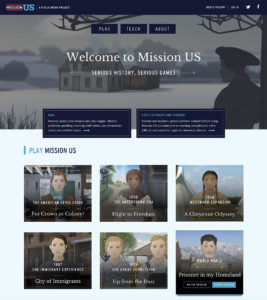
When we worked with WNET on their Mission US game platform, we presented a sophisticated design for middle and high school students. Mission US is a complex storytelling game that invites students to choose their own first-person adventure during famous moments in U.S. history. Mission US has stunning visuals and encourages complex decision-making, which makes it a compelling learning tools for students.

We researched other first-person games students play and love, and our findings impacted layout and design features for the site. For example, a video trailer that previews the game draws students in. It's not a typical design move for edTech, but we knew the game's cutting-edge visuals would speak to students using WNET's resources.

When we explained these decisions to our client in the first visual design meeting, it gave us the opportunity to tie important design choices back to the project's original goals. For example, we wanted to ensure that students knew where to go and what to do to begin each game. This priority was reflected in our design choices, layout, and call to action placement. We also decided to change the original design to make teaching and educational resources equally as important as gameplay. Educational content is now a main feature of the site and is easy for teachers to locate, preview, and interact with.

By conducting extensive user research and linking design choices to strategic goals, we help stakeholders understand what their users expect from a high-quality edTech product.

2. "I don't know what this is."

Have you ever been thrown by a wireframe or a user journey when you look at early product mock-ups? You're not alone.

Some of the best tools for understanding design features are the product's initial wireframes. Wireframes are like the blueprints for a house. They don't reveal everything about visual design, but they will give you and your stakeholders a sense of visual placement and important user interactions.

It's also our job to help you visualize things you can't see at work this early in the process. During the initial visual design presentation, we narrate all the interactions we can't show in 2D, like digital animations or hover properties. These are all the interactions your users will find engaging and delightful, but simply don't translate to 2D design.

We always encourage our clients to ask questions at this stage, too. When you feel empowered to ask questions, there is less confusion all around. Clear communication ensures that you have all the information you need to make the best decisions about your product.

3. "Should we add…"

It's common to get all the way through the UX planning and visual presentation phase only to feel as though you should add more features to your product.

Sometimes the urge to add new features means we haven't yet uncovered the primary goal of your product. More often, though, it's a sign that we might be trying to solve a UX problem through design — and that makes everything more complicated.

That's when we go back to the wireframes. We really want our clients to understand the structure and hierarchy of their product, so we make complex decisions about product features together.

But we also want to educate our clients about the most effective ways to design a menu or a data dashboard. Complex features like data dashboards grow and change over time. We always show clients major design features like dashboards in their beginning state, as well as how that feature will change as users generate data. When you give users just what they need, instead of everything they might want at once, you avoid visual overload and make your product even easier to use.

4. "This approach just doesn't feel right."

It's not always easy to explain why you don't like visual design. Sometimes it really comes down to a feeling or a preference. So how do you communicate more effectively about this with your design team?

This is when we start asking more specific questions about what you want to see and use "deep listening" to fuel our responses to feedback. What about the approach doesn't feel right? What will your users expect when they open this product? What's your goal for the user at this particular part of their journey?

The more we can uncover about which goal isn't being reached by a visual design, the more we can delve into user experience to deliver a solution that really works.

We'll also work hard to tell you which design decisions were based in best practices and which are backed up by data. With surveys and user stories driving the conversation, we get to the heart of the matter while ensuring that everyone on your team is heard.

5. "I like it, but I'm not sure my boss will."

It's especially important for stakeholders to participate in design presentations. Not only does a presentation reinforce your planning and decision-making, but it also creates buy-in from every member of your team — including your supervisor.

The visual design presentation is also an opportunity to take our clients through the decision-making process from top to bottom. We tie design decisions directly to UX planning and user pathways, so stakeholders can better understand how each decision in the UX planning phase reflects user expectations. We want to make sure you remember how we arrived at each UX and design decision together.

Visual design presentations are the result of a long, collaborative process. Remember: we're here to make you look good! Design presentations reflect all the careful decision-making and hard work you put in along the way. With the right preparation and execution, stakeholders will feel even more confident that you'll deliver an exceptional product users will love.

January 14, 2020 - No Comments!

How to Incorporate SEL into any edTech Product

Over the past decade, the education world has embraced the idea that respect, social awareness, and relationship skills are integral to a student's success in school.

These qualities are fundamental to a student's social-emotional learning, or SEL. After all, data shows that when a student doesn't have to worry about bullying or knows how to manage the pressure of taking a final exam, their ability to learn and retain new information improves.

edTech has zeroed in on this trend, too. There are now a slew of digital products that offer SEL teaching strategies and improve students' SEL. But if we want to be truly inclusive edTech designers, we can incorporate SEL features into any product—not just ones that are designed specifically to teach social-emotional skills.

This forward-thinking, equitable approach to product design bolsters student engagement, creates more effective learning tools, and addresses customer pain points in a more seamless way.

SEL Design Strategies: How SEL Concepts Map onto Product Features

According to The Collaborative for Academic, Social, and Emotional Learning, or CASEL, social-emotional learning can be defined by how a student develops the following attributes:

  • Self-awareness
  • Self-management
  • Social awareness
  • Relationship skills
  • And responsible decision-making

Teachers incorporate classroom activities that promote student growth in these areas all the time, from peer feedback activities to group projects to reflection prompts. Crucially, curricular activities designed to bolster SEL aren't just taught in isolation. SEL strategies are often incorporated into lessons on any subject, from math to reading to life sciences.

EdTech can draw on this framework, too. By using product features that promote collaboration, community-building, and creative problem-solving, we transform an edTech tool dedicated to subject-area content into a more comprehensive learning opportunity.

SEL techniques deliver more robust outcomes from any edTech application, as well as higher engagement from students. But digital tools with SEL features do more than help students tackle and retain new concepts. These features promote growth through process skills, communication, and collaboration.

For example, if you're designing a math or physics learning tool, consider incorporating ways for students to visualize, model, or sort data. By giving students multiple ways to analyze and solve a problem, you allow them to apply lesson content in broader contexts. They might even arrive at more unexpected—and brilliant—solutions.

In addition to promoting process skills, products with SEL features have the ability to address how users feel about difficult subjects like math and reading. When we research, design, and test with SEL strategies in mind, our products become more understanding of students' needs—and more useful to the teachers and students we serve.

Uncovering the Right SEL Features Through User Testing

It's an edTech designer's job to understand the emotional mindset of their user, a process often clarified by user testing and research. When you conduct initial research on users, you learn crucial information about their pain points as they try to accomplish tasks within your software.

This stage of the design process also offers opportunities to research and test the SEL components of your digital learning product. How do your users feel about math or reading in general? What's their preferred learning style? Can you uncover the way students think about math concepts? How might they communicate those concepts to someone like an instructor or a peer?

By researching the emotional mindset of your users during product testing, you can more effectively pinpoint what motivates students to learn. You'll gain insights into a student's emotional stumbling blocks around a subject. You'll also learn more about how students communicate with one another and with their instructors.

These interactions are also valuable to capture in testing environments because they help UX teams understand the complex mechanics behind collaborative group projects. Your UX team will be better positioned to design reflective or multi-step workflows that facilitate group learning in a digital format.

The more you learn about emotional mindsets and group dynamics during the testing process, the easier it will be to incorporate meaningful SEL features into your product. No matter what subject area your product happens to be in, SEL features immediately add value to students and instructors alike.

Learning tools that provide SEL strategies for students build engagement, efficacy, and delight in learning. They also give teachers a better understanding of how their students explain complex ideas and process complicated tasks.

Wondering how to translate SEL concepts into effective product features that students and teachers will love? We've got you covered.