
All Posts in Early stage UX strategy

May 15, 2020 - No Comments!

Where Does Your edTech Product Fall on the UX Threshold?

If you've ever tried to sign your child up for a PlayStation or Nintendo Switch account, you know how complicated digital experiences can be. When it comes to popular gaming sites, most tech-savvy parents are willing to put up with less-than-ideal UX just to make their children happy.

For every digital experience, there's a UX threshold. When the digital experience is so frustrating that the user no longer finds value in the product, the brand has pushed too aggressively against the limits of the UX threshold.

Some brands with particularly loyal users might be "lucky" enough to stop investing in better UX. But if a company has decided that its profitable threshold allows for a poor UX, do they have any obligation to improve? Beyond lost revenue, is there ever a moral obligation to make their products more user-friendly?
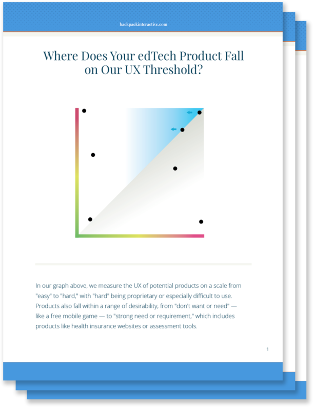
If you're designing edTech products, the point at which your user becomes frustrated or stymied by a complicated UX is even more important to gauge. After all, whether you're working for a nonprofit company or a well-established educational brand, good UX in edTech becomes an issue of access and equity.

Your users need products to pass a class, learn a critical skill, or pass a standardized test in order to attend college. What happens if a teacher experiences a high level of frustration when trying to use your product in the classroom? Or your user is a parent who isn't technologically savvy? Or an administrator desperately needs your technology to improve outcomes for their school?

Because the stakes are so much higher in our industry, we should be motivated to design tools that do more than meet our bottom line. And that means the UX for even the most complex learning tools needs to be as streamlined and accessible as possible.

Ditching Highly Proprietary Design Patterns: Reducing the UX Threshold for Complex Administrative Tasks

It might be easy to improve on bad UX, but making good UX great requires complex problem-solving from your UX team.

In edTech, the administrative aspects of learning products often have the most technical complexity. By leveraging common UX patterns, you'll lower your UX threshold and make your product something that meets teachers and students where they are.

Administrative complexity looks different depending on your primary user. For teachers, administrative complexity may involve setting up the software for the learning product, creating user profiles, rostering students, or managing multiple staff users. For administrators and IT professionals, it might mean navigating multiple screens, connecting to outside systems, or learning how to share data across platforms. And for parents, administrative complexity requires learning how to sign up their child as the product's primary user. It might also mean taking advantage of available learning outcomes data in order to make informed decisions about their child's education.

In order to lower the UX threshold for your product, leverage existing UX patterns that won't require users to learn a new, proprietary system or go to multiple places to accomplish a simple task. Lowering your UX threshold encourages your user to engage with the task at hand, which leads to higher completion rates within your product. It also helps shift the user's mindset from tense to relaxed. A tense user will tend to have a lower frustration threshold for completing tasks.

Even if you're using well-established UX patterns, there's plenty you can do to provide a fresh and delightful experience for your user. Micro copywriting, visual design, and other touches provide your experience with a unique look and feel without causing cognitive overload.

The more you can do to meet schools, teachers, and students where they are, the more relevant your designs will be. You'll create learning products that solve problems and integrate with a teacher's day-to-day technology. And you'll design tools that enhance and extend what administrators are already using — all without adding complexity for your users.

Leveraging Interactive Complexity to Help Students Learn

In edTech, designing a product with interactive complexity becomes even more important. We have an obligation to consider how to make interactive teaching moments rather than static ones. We must strive to work with subject matter experts to determine how to break a topic down, so students work with material in a rich way.

Most learning products demand a high level of interactive complexity from UX designers. Ideally, students are able to learn new concepts or skills as they move through an experience and interact with it. However, this level of interactivity adds to a product's UX complexity, and UX designers often remove interactivity from the moment of instruction or assessment — just when students need it most.

For example, a learning product with interactive science experiments might have two separate interfaces. In one interface, students are introduced to scientific concepts illustrated by the science experiments. In another, they might be encouraged to interact with the science experiment itself.

However, if you separate the interactive interface from the problem students are trying to solve, you'll wind up creating a higher barrier to learning. You'll design a cognitively disjointed experience, which isn't how students experience learning in the real world. Students will end up learning how to use your product — instead of learning a new concept.

While it may seem counter-intuitive, leveraging interactive complexity actually requires you to simplify the UX for your product and reduce its UX threshold. The more you simplify your UX, the more likely you are to make a product that showcases important concepts and engages the students who need your product to learn.

The ROI of Investing in Great UX by Reducing Your UX Threshold

Even if you're building a complex product, there's real ROI to investing in UX. Not only do you help teachers, administrators, and parents onboard and navigate your product quickly, but you also improve learning for students by connecting new concepts and skills to interactive UX.

Concrete design requires both the administrative and interactive parts of a product to work together in concert, even when they're individually complex. When you use an approach like concrete design, you make a product that's more likely to be bought or adopted. Teachers and students respond to a product that's easier and more fun to use, increasing overall engagement with your product.

You also reduce cognitive load within the product, which means less training time for teachers and less onboarding for students. While onboarding for any product is necessary, there are downsides to a long, drawn-out adoption process. If your onboarding strategy depends too heavily on textual explanations, for example, you introduce more barriers to students and teachers with learning differences.

When you reduce training and onboarding needs for your product, not only are you building a more equitable product, but you're also shifting resource allocation within your budget. Suddenly, you don't have to spend a large chunk of your project budget on designing onboarding tools. Instead, you're able to focus those resources on developing product features and creating outstanding visual design.

When you build a tool that's more intuitive to use, you directly impact your bottom line. Improving UX leads to more revenue streams as you widen your market and roll out a product that's more accessible and easier to use. When you give potential clients a demonstration of your intuitive product, your sales team has to do less explaining — and the product begins to sell itself.

Why the edTech Industry Should Care About Making Good UX Even Better

Like you, we care about designing intuitive edTech products that solve real problems and are adopted widely by schools and school districts. But we also recognize that the edTech industry has different users and goals than consumer tech.

The stakes for edTech products are much higher. Good UX can be the difference between a student learning a new concept and struggling to master it. It can also mean the difference between a product that all students can use and a product that excludes students with learning disabilities.

Because the stakes for our products are so high, we have a moral obligation to identify the point at which bad UX creates barriers to success — and push ourselves to make good UX even better.

April 3, 2020 - No Comments!

Using Wireframes to Power Your UX Design Strategy

Product wireframes are one of the first strategic milestones of the design process. All stakeholders depend on them, including product owners, developers, and front-end design teams.

When designed intentionally, wireframes facilitate important decisions early in the UX process. They provide a visual record of discussions about big-picture product goals, user flows, and technical requirements.

At Backpack, we use wireframes throughout the iteration process to lead stakeholders through strategic conversations before moving to visual design. Using clickable wireframes and prototypes also helps us establish our workflow with technology teams and developers early in the process.

Here's a glimpse into the process we use with clients to create an ideal workflow for major stakeholders and other teammates.

How Wireframes Guide Stakeholders through Strategic Decision-Making

For product stakeholders, wireframes facilitate strategic discussions about big-picture needs and product goals. They reflect how the product should be organized and give stakeholders the opportunity to address whether your UX team has captured the most important features. Does your product need all the features represented in the first iteration of the wireframe? Or can your team simplify?

By sharing wireframes with stakeholders early in the UX planning process, you streamline top-down decision-making that benefits both your users and the product development team. Because wireframes reflect the implications of product design and UX decision-making, this tool helps stakeholders better understand the needs and expectations of your users. Has your UX team accurately reflected each user flow in the wireframe? Are features where your users expect to find them? Has your UX team named features in an understandable way? Has the team found a way around information overload?

At Backpack, we feel it's important to use wireframes to help clients envision key elements of each user flow and see how they'll work. We mock-up ideal flows quickly in clickable wireframes. By grouping information realistically for the user, stakeholders are able to imagine user experience prior to testing. This process also helps stakeholders anticipate content needs, including the photos, multimedia content, and other resources that will create the best possible user experience within your product.

As we designed the Literacy Pro app for Scholastic, wireframe iterations facilitated important top-level discussions about micro user flows for both teachers and students. How would teachers add and assign assessments? How would students access and take those reading assessments?

Using clickable wireframes ensured that each stakeholder discussion centered on user personas and the contextual flow of interactions. Because clickable wireframes reinforce the needs and expectations of the user, this iterative process set us up for success by the time we tested the product with Scholastic's users. After testing, we could iterate even more efficiently.

How Annotated Wireframes Facilitate Technology Discussions with Development Teams

Ideally, annotated wireframes help UX teams communicate more effectively with developers. This collaborative method helps your UX team think through the technical issues of each screen and gives your development team a chance to communicate when a design decision might be technically burdensome.

Facilitating these discussions early in the design process eases work-flow challenges — especially when you're managing multiple teams and vendors. Before they're ever given design files, your developers are able to structure the back end and hit the ground running once designs are confirmed.

Backpack uses wireframes early in the design process to communicate with developers about complex technical needs. We give developers every opportunity to vet the logic of the UI for primary user flows, typical interactions, and edge cases. Wireframes are an excellent tool for these teams to spot potential problems with back end logic or technical services before the product is built.

This was especially true for our work on Scholastic's Next Step Guided Reading Assessment, or NSGRA. This software encourages teachers to group students by reading level using a visual drag and drop interface. Visual design indicates to teachers that the UI is clickable and moveable, while the back end is designed to quickly accommodate any changes teachers make with just one click.

Our development team helped us think through the complexity of this design decision by annotating early wireframes. They asked smart questions about the interface's logic from a visual standpoint, as well as the implications visual design and UI had for data and reporting. Throughout this iterative process, our development team's input helped the design team create a clear and visually compelling UI and clarify software interdependencies. Without input from the developers early in the process, it would have been more difficult to arrive at the most intuitive solution for users or anticipate technology needs from the beginning.

How Wireframes Establish Style and Front-End Design Decisions

Front-end design teams depend on wireframes to establish style and design for the entire product. Approved wireframes serve as their road map for compelling visual design. When, where, and how will you display product features? Should you use a drop-down menu or a form? A complex calendar or a to-do list? Does your product need a dashboard?

As a creative firm focused on strategy, Backpack offers clients a design-led process. Visual design brings wireframes to life, illustrating design decisions and contextualizing content needs in a rich and nuanced way. Wireframes are also an important tool for communicating with our front-end development teams. Front-end developers need to understand the specific functionality of UI, as well as a product's logic. One of the only ways to accomplish this is to check interactions within wireframes and pass annotations back and forth between teams.

Our recent client project, the Wharton School of Business "Pivot or Perish" simulation, spurred an intensive back-and-forth with our front-end developers. While the simulation itself required us to design a small number of screens, the interface within those screens was highly transactional. This means that complex student learning happens within nuanced user interactions.

Communicating user interactions effectively to our clients demanded a hard-working wireframe. In order to ensure our front-development team also understood each interaction, we documented and wireframed each action separately and collected feedback on the logic of our UI.

During the visual design process, we defined the visual vocabulary of the product through specific color and shape palettes. Because we had already determined interactive elements throughout the wireframe stage, Backpack could successfully design user interactions that only made sense from a visual design perspective.

Ultimately, the extensive wireframing process for this product ensured that every team member — including our client, front-end developers, and Backpack's visual designers — was on the same page. By the time we arrived at the visual design stage, everyone was aligned on product functionality, and there were fewer visual design strategy issues to navigate together.

Testing User Flows and Capturing User Feedback in Real-Time

Wireframes also facilitate important discussions with your users about product categories and logic. Once your wireframes are connected together into a clickable prototype, you can test designs and capture feedback from users who depend on your product to solve a problem. Do your design decisions work? Can your users find expected features or design elements within your interface? Is information organized in a clear, understandable way?

Backpack regularly shares clickable prototypes with users to observe how they complete individual tasks. We analyze user interactions, document the challenges users face, and develop new strategies for incorporating user feedback.

During the product design process for the NSGRA, we tested clickable wireframes with 20 teachers. We went into the interview process knowing that users already faced very specific pain points. The product requires a lot of data entry, and we worked hard to improve that workflow to make it as quick and painless as possible.

We used Axure, a robust prototyping tool that allows for "WYSIWYG" programming, to show teachers specific micro-interactions within the NSGRA. They added hypothetical student data into complex fields and saw how the UI changed from screen to screen in real time. By interviewing teachers as they completed tasks, we collected helpful insights about the value of the product and made easy improvements to the workflow.

No matter which phase of the product design process you're in, clickable wireframes give you and your team the power to facilitate important strategic discussions. You'll ensure your stakeholders keep users front-and-center, ease technical discussions across teams, and drive user-centered design decisions every step of the way. The earlier you use wireframes to guide important decision decisions, the easier your build will be — and the happier your users will be with the finished product.

January 15, 2020 - No Comments!

User Testing: When Technology Insights Solve UX Problems

Systematic user testing is a key part of developing any user experience strategy. Everyone on your product team wants to solve pain points as quickly as possible, and you're eager to test whether you've created something that fulfills your user's expectations.

You also hope user research and testing will give you insights that your marketing team can use to appeal to future customers. From a marketing standpoint, this testing approach seems like a win-win. But it can also leave your UX team and technologist without the technical information they need to solve real problems and offer groundbreaking solutions. 

User testing is so much more than ticking a box on the road to product launch. When you design user testing prompts that move beyond functionality, your UX team can leverage testing insights to solve complicated user problems in new, intuitive, and innovative ways.

Here's how you can ensure that your researcher, technologist, and UX team employ user research to design more effective, user-centered products:

  1. Help your UXR specialist write questions that map to an actionable goal
    Before you get to the testing phase, work directly with your research technology specialist to develop questions that align with your technology and UX needs.
    Generate actionable goals related to product design or UX that you can map directly onto specific UXR questions. This will help you get a more accurate picture of how users will interact with your product. Actionable goals also give you a head start as you consider what to do with your research findings.
    If you're developing a script, questions should center around the goal of the product rather than design elements or desired features. For example, you could ask teachers whether a product fits into their day, or whether they could use a product with a student sitting next to them. The answers to these questions will help you understand if you've met the big-picture goal of product design.
  2. Consider whether your UX problem is a technology problem
    We've all had an unexpected problem crop up during user testing. But what seems like a UX fix might instead be a technology fix. Is a user struggling because they don't have access to the right technology for the product? Will incorporating machine learning help a teacher quickly grade or assess large amounts of student data instead of having to do it manually?For example, when Backpack designs a new onboarding process for teachers and administrators, we consider whether it's appropriate for forms or data to auto-save throughout the process. Onboarding for a new product can take educators a long time, and automatically saving forms throughout the process often improves UX. However, from a technology standpoint, auto-save is a heavy lift! Without input from a technologist during the testing phase, it would be difficult to determine whether this "UX problem" could be solved efficiently on the backend.

    When UX teams and technologists work together, they're able to suggest solutions that address fundamental problems instead of expending their efforts re-designing a product's interface. Sometimes a UX problem really is a technology problem.

  3. Ensure that your UX team understands the user journey from a tech standpoint 
    In order to offer the best possible solutions, UX teams need to understand how users engage with technology. Which devices will the product be used on? Which parts of the product will get used on mobile? Who will maintain the product once it's sold? What kind of workflow does this user have? How fast is the product on the user's typical internet connection? How robust is the search function?Tech-related questions are easy to incorporate into user surveys at the beginning of the research process. Tech-driven user surveys will give your UX team all the relevant data they need to propose more effective solutions.
  4. Encourage collaboration during the solution phase
    Your UX and design teams should participate in recommendations for what happens with front-end development. Increased collaboration between technologists and UX designers makes it easier to determine whether a technological solution or an interface solution will help your users accomplish their goals best. Ultimately, you want your team to have more opportunities to explore broad, creative solutions to tricky user problems.
  5. Use accessibility as an additional tech and UX benchmark
    Designing and testing for accessibility adds expense to your bottom line, but the research and testing process contains opportunities to address accessibility without breaking the bank.For instance, a product's speed or its lightweight feel is an issue of equity. Old or poor quality hardware makes new digital products more difficult to use, but you'll still find outdated, sluggish computers in many school districts with low IT budgets.If you view accessibility as a technology issue, it's possible to incorporate the right questions into your user testing to ensure compliance—and design more accessible products in the long run.

How to Leverage User Testing to Develop an Innovative User Experience Strategy

For better or worse, you can't ask users to come up with big ideas about your product on their own.

Instead, you'll need to develop a strategic framework that takes user conversations and funnels them into user experience strategy and iteration.

Conversations that unpack user testing, overarching product goals, and technology solutions will allow your team to truly think about user experience strategy — not just generate a new wishlist of product features.

Here's how to stay on track as you prepare for user testing and delve into the results:

  • Do your homework. Once you've conducted desk research and preliminary strategic concept discussions with the product team, you'll go into interviews ready to consider what you learn through the lens of experience and expertise. 
  • Use deep listening techniques. When you use deep listening to get to the heart of a product, you uncover unexpected solutions that solve your user's problems in more innovative ways.
  • Reflect as a group. Gather stakeholders, the product team, developers, and your research technology specialist to reflect on what you learned throughout the user testing process. It's important to build in time at the end of user testing to listen. Multiple perspectives on user testing conversations often lead to "ah-ha" moments of clarity for everyone on the project.
  •  

    Whether you're months away from generating user research questions or getting ready to observe users interact with your product, look for opportunities to listen, reflect, and collaborate on technology problems with the input of your UX team.

    Not only will you hit on more innovative, user-centered technology and design solutions, but you'll also create a stronger product that solves real problems for your users. That's the kind of product destined to make a difference—and tick all the boxes for your stakeholders.

    December 19, 2019 - No Comments!

    7 Best Practices for Testing Digital Products in Schools

    User testing is exciting. You finally get to see your edTech product at work as 25 little people in a classroom begin pushing all the buttons on your product at once.

    Testing digital products in schools also presents a number of challenges for product designers.

    For example, there might not be enough time in your schedule—or enough wiggle room in your budget—to make substantive changes.

    Or the questions developed by your UX team might gently color a user's experience of your product, giving you inaccurate data about how new users engage with each feature.

    Set your team up for success by thinking through user testing in schools from the very beginning of the process. Here's how we design user testing to get to the heart of your users in their every-day environment.

    User Testing in Schools: Getting to the Heart of Your Users in their Environment

    1. Develop the right mindset. You've already tested your prototypes. You've iterated your product along the way. You've even road-tested it with users. By the time you're ready to test in schools, you might think there are no surprises left. But that's where your mindset can shift. The point of user testing is to discover the many unexpected ways users will interact with your product. It's important to remain open-minded to the possibility of change, even late in the game. After all, small changes in your UX can create a much better experience for your users.

    2. Build design changes into your schedule and budget. To get the most value out of testing, incorporate design changes into your schedule and budget. Be clear with your team about the differences between cosmetic changes that won't impact a product's success and changes that will make a lasting, positive impact on your user's experience. Use all the feedback you receive from testing to improve your product's UX in substantive ways.

    3. Choose a true sample of users.Testing reveals how the average user learns to engage with your product in real time. For the data to be most effective, strike a balance between testing internal and external users. Internal users will give you important insights into how the product should work in an ideal world. External users, especially those who aren't tech savvy, reveal what might be confusing or unexpected about your product.

    4. Identify specific microflows that are essential to the product. At this point, it's probably been awhile since you thought about how students and teachers log in to your product. Or how teachers create a new class. Or how students engage with their peers on your platform. Think through the microflows that are most meaningful in each user journey and focus your attention there during testing. What did students have difficulty doing? What features confused or excited them?

    5. Concentrate on functionality. Help your users focus on functionality by incorporating clickable wireframes and other prototyping into your testing process. Wireframes eliminate any potential distractions created by visual design and allow users to really think about how a product works. Screensharing and heatmapping tools also help you see where users are directing their mouse. Are they wandering around on screen? Skipping over the login button because they expect it to be located in a different corner of their monitor? Be open to changing visual designs based on what you see after testing functionality first.

    6. Design open-ended questions. If you "lead the witness" in user testing, you're not going to get a real answer about your product. Open-ended questions allow you to dig into responses and discover whether users are getting what they should out of your product.

    7. Understand — and prepare for — the school environment. It's good practice for both product owners and the UX team to be in the room when users test products. This is especially true in school environments, which might have outdated hardware or bad internet connections. These hurdles are easy to forget in the comforts of your own office. The technology available in schools will also affect your testing outcomes. Make your product as lightweight as possible and scale it for the ChromeBook, which is commonly used in schools. Observe how the school environment impacts the ways your users interact with the product. Were there any unexpected stumbling blocks that might impact your UX or UI?

    Done right, user testing reveals how your product will help students learn a new concept or guide teachers to create detailed reports about their classrooms. This crucial process also reveals where you can still improve the UX and UI in meaningful ways for your users.

    Time and again, we've seen how a thoughtful, data-driven user testing process affects final product design in surprising ways. With these best practices in place, you'll be ready to tackle user testing for any edTech product and give your users exactly what they need.