All Posts in Researcher

September 29, 2020 - No Comments!

What’s Your Baseline? How to Make UXR More Valuable for Your Next edTech Product

UX designers in the edTech space are specialists who participate in a community of educators. To design well, they must have more than a working understanding of best practices in UI. edTech UX designers also need a background in learning science and user research. These specialties help UX designers accurately identify and design for the specific needs of the teachers, students, and parents who use their tools.

With a specialized background in UXR, edTech designers establish a baseline understanding of their users over time and quickly identify gaps in understanding during each new client project. These user baselines also allow designers to use the UXR phase more effectively, scaling research to fit a project and investigating tactical ways to quickly improve a product for its intended users.

This is especially true when designing for a specific subset of edTech users. edTech designers then start with a research baseline and use it as a framework to re-examine their assumptions. Foundational knowledge of user needs accelerates the development process in these cases and creates an even stronger framework for the user research you conduct.

Here's a quick breakdown of common research baselines you can use to ask better questions during the UXR phase of your next edTech product.

The Key to Designing edTech for Teachers

To meet the challenges of an edTech product for teachers, edTech designers must understand the foundational needs teachers have—their challenges and pain points—and be able to further narrow their focus to specific subject needs. They must also understand the entirety of a teacher's world, whether a teacher works with underserved populations or is gearing up for state assessments.

When you talk to real teachers throughout the UXR process, you're able to look beyond the needs of a fictional persona. Throughout surveys and interviews, you'll refine your understanding of how teachers navigate digital and offline tools. Once you know what a teacher's pain points are, you can prioritize them and establish their relationship to your business goals. You'll discover whether your tool will work in their classroom and likely make tactical changes to your product.

By working with edTech specialists throughout the UXR phase, you'll be one step ahead. edTech UX designers already know enough about the needs of teachers to work from a specific user baseline—even if we test those assumptions throughout the process. Here are the baseline assumptions about teacher pain points you need to know to design more effective UXR sessions:

Teachers conduct their work on mobile devices.

Understanding how and when teachers are likely to use edTech products on their phones is a must. Most likely, you'll need to simplify sequencing and processing for mobile design to make the product easier to use on the go.

For example, if you had a product centered around student assessments that could only be completed on a desktop, you might consider a professional development component to your product that worked well on mobile devices. We know that many teachers want to access this kind of content outside of their own classroom environment. Mobile-first professional learning content is a great baseline assumption to work from as you design your user experience research for a teacher persona.

Teachers are looking for more ways to address SEL growth.

Teachers recognize that technology plays a role in mitigating isolation during remote learning. edTech tools that help teachers reach students more effectively and build SEL skills will become ever more valuable. Research suggests teachers are more optimistic than ever about the ability of digital tools to facilitate one-on-one connections at times when those are not possible.

Teachers use edTech tools for instruction in one of three ways.

There are three different modes of instruction: whole group, small group, and individual instruction. We know these are consistent modes, especially for teachers of younger students.

Teachers with high school-age students tend to adopt individualized instruction modes when using edTech products. This is often because students have their own ChromeBooks issued by their school, which means teachers can depend less heavily on shared resources.

But individualization features do more than facilitate adaptive learning for individual students. They also aid adaptive learning in small groups. Work with teachers to discover how individualization features for your product will also affect full-class teaching.

Why Designing edTech Software for Students is Uniquely Complex

Designing edTech software for students is a much more complex task than solving for the common needs of educators. One complicating factor is age and grade level—the differences between K-2 are vast, and the jump between K-2 and 6th grade is even bigger.

Designing tools for students in higher ed is a different story altogether. All students are now adults and data and privacy concerns shift completely—just to name a few moving targets.

Even though designing for students comes with its own unique set of challenges based on age, grade level, task, and access to school technology, there are still a few baselines you can always work from when you're conducting UXR for your product. Here are three assumptions to work from:

Age affects independent learning with your edTech product.

The younger a student is, the more their teacher or parent needs to be involved in their interactions with your product. This will affect how you design everything from log-in screens to interactive features.

When you design edTech tools for older students, on the other hand, they're able to be more independent within your product and complete tasks on their own. It's also easier for a teacher to assign a group project to older students. Students and teachers alike may come to expect these types of instructional features from your tool.

Students expect consumer-like design patterns.

For most students, the context for interacting with edTech tools will be consumer products or games. These products have a high production value and plenty of digital media for kids to peruse. What are the patterns of consumer media that might apply to your product? Whether it's well-produced video instruction or complex game-play, the features in your edTech tool will be held up against the best consumer products on the market.

Students will use your edTech product at home.

Digital learning products always extend from the classroom to the home. Even during our pre-pandemic era, edTech products were regularly used in the home on shared computers or mobile devices. The better you understand a student user's home environment, the more successful your tool will be in the market.

For instance, if your product is designed to improve reading and literacy skills, you already know there's a good chance it will likely be viewed on a mobile device at home. You might even be able to assume that your student users will need more help figuring out next steps since they're out of the classroom and no longer receiving one-on-one instructional support from a teacher.

With these baseline user assumptions in place, you could instead focus your UXR efforts on finding the right balance between rigid sequencing and designing for students agency within your product. You'll want to ensure that your software directs student progress from the moment they log in without taking away elements of student independence, engagement, and discovery. It's a tough balancing act to get right—which means it's the perfect contender for your UXR efforts.

Designing Software for edTech's Fastest Growing User Base—Parents

Parent users have always had a facilitating role in edTech tools designed for younger students. When most students started remote learning last spring, parents took on even greater roles in learning technology. This is unlikely to change anytime soon. In fact, we think parents users are here to stay.

Here are a few of the baseline assumptions you need to make about edTech's next big user:

Parents are looking for easily digestible insights.

Parents with younger students have a co-working relationship with their children within a product. Parent users will facilitate, guide, and troubleshoot as their young children complete tasks.

As their children age, parents play less of a role in how students use a learning tool. Instead, they begin looking for insights into their child's performance. Parents of older children may want a dedicated portal that displays data on how their child uses a specific product.

What administrative data captured by your tool might be valuable to a parent user? Everything from how long a student session lasts to engagement or achievement rates helps parents get more involved in their child's education.

Parents want to weigh in.

Now that parents are more involved in remote learning with digital tools, they're looking for more ways to interact with their child's teacher and provide feedback on tools. They're become more savvy than ever about everything from ease-of-use to integration. The more opportunities you provide that open the channels of communication between parents and teachers, the more valuable your edTech tool will be.

As you can see, the assumptions you begin with when designing edTech products shape the kind of user research you conduct. With the right research and evidence base, you can build off of user assumptions and conduct ever more meaningful UXR sessions.

UXR is always valuable—but it's even more valuable when you can work off baseline assumptions and truly scale UXR to the most unique aspects of your product.

September 11, 2020 - No Comments!

How to Design Impactful Digital Experiences on a Small Budget

Nonprofit and community organizations are already working hard to support their communities with few resources. The realities of the COVID-19 pandemic have made delivering these services even more challenging, especially for organizations that depend on in-person programming.

If your mission is to fill a critical gap with educational programming or services, it's our mission to support your shift to the digital sphere. Whether you have a shoestring budget and a small staff or dedicated resources for digital experiences, this article will help you design experiences that help you serve your community.

The Value of Creating a Digital Interactive Experience Right Now

If the sudden onset of remote learning or social distancing drastically impacted your ability to provide in-person services, your organization might be struggling to reach community members in need at the same scale.

Creating a digital experience showcases your organization's content and expertise while also providing a powerful stop-gap as you wait to safely resume in-person services. But digital experiences have value outside of temporary solutions, too.

Executed well, a powerful digital experience permanently transforms your organization by enhancing your ability to fulfill your mission. By curating your content in a creative way online, digital experiences extend the reach of your organization and make your content or services even more accessible to your audience.

Organizing and formalizing your message also leads to positive outcomes for your organization. The act of curating your best content helps small teams become even more effective communicators and advocates of your mission.

How Nonprofits Can Scale Digital Experiences for Their Staff and Budgets

No matter how big your organization is, building a digital interactive experience is scalable.

You don't have to create an out-of-the-box product or completely re-tool your mission. In fact, if your idea for a digital experience changes your understanding of your mission, that's a much bigger conversation!

Start small and scale your digital resources based on your budget and bandwidth. There's value in thinking big if you're ready to think big. You can also build something meaningful right where you are. For example:

  • Embed existing YouTube content into your site along with suggestions for using content in the classroom.
  • Offer pre-existing print lesson plans as downloadable resources.
  • Curate pre-existing digital content on your site in a meaningful way for your audience.
  • Create a podcast.
  • Publish actionable blog posts.
  • If you're an outdoor organization, set up a webcam that allows your community to watch the activities that you sponsor. For instance, if you're a zoo or wildlife refuge, your audience may want to watch and connect with animals.
  • Use existing payment platforms to capture sales for classes or products or to collect donations. (Be aware that these platforms also take a percentage of your sale.)

Before you begin brainstorming ideas for your own digital experience, consider the return on investment for your organization or team. Can this digital space or tool be self-sustaining? How will you use this space even after you're open to the public?

Just take national nonprofit ReadWorks, for example. Their mission, to create a powerful ELA curriculum, required an equitable distribution policy to make the biggest impact. The organization transformed their curriculum and teaching tools into a free digital experience with national reach. By thinking digitally, ReadWorks went on to register and support more than a million teachers in every state in the country.

But your organization's digital transformation doesn't have to operate on a huge scale. SuperD!ville, an educational site that helps teachers integrate SEL concepts into middle school curricula, started out with a YouTube channel containing video lessons. As they grew, they added a subscription model and instructional tools for teachers who wanted to use SuperD!ville video content as part of their curriculum. Another educational nonprofit, Learning Ally, designed an entire portal for parents who want to support their child's literacy at home. They provide audiobooks, graphic organizers, and other literacy content—all for free.

Extend Your Organization's Reach with a Digital Interactive Experience

Whether you make existing assets more readily accessible to your audience or entirely transform your organization's digital presence, designing a digital experience boosts your mission and extends your reach.

When you design digital experiences with a growth mindset, you support your mission far into the future—long after you return to in-person programming. By setting yourself up for success during the planning phase, you'll be able to execute on bigger projects in more meaningful ways and feel proud about expanding your mission.

Even if you start small, there's value in thinking big.

August 6, 2020 - No Comments!

Remote Learning Puts Teachers in the Role of UX Designers. What’s Next for edTech?

Teachers have always recognized how valuable in-person instruction is. In fact, they rely on these relationships to help students succeed. This dynamic is central to how they learn to gauge student progress—even without formal assessment.

When at-home learning made one-on-one instruction next to impossible, teachers had to pivot. They immediately reached for new ways to foster crucial relationships with their students using technology. They created sophisticated versions of their curriculum using stitched-together technologies, digital platforms, and online resources.

In many cases, teachers haven't even chosen or purchased the classroom technology they've now come to depend on. Districts or school administrators buy tools and product licenses, while teachers coordinate responsibilities across teams or grade levels. Sometimes they even share user responsibilities within a single account.

Because they now have to rely heavily on digital tools for instruction, teachers have also started to think as designers of digital learning experiences. This has prompted deeper and richer teacher engagement with digital learning tools. From integrating the tools purchased by their districts to sequencing activities, teachers are thinking like UX designers, striving to create the best possible experiences for their students.

But if teachers have started thinking as UX designers, where does this leave edTech?

How edTech Can Support New Demands on Teachers as Designers of Digital Learning Experiences

With new demands on teachers come new demands on UX designers. As you roll out digital products or update existing ones for the fall, here are four elements that will support the work teachers are already doing during at-home learning.

  1. Develop product integrations.
    edTech solutions that integrate easily with other products or platforms have always been valuable to busy teachers. Now, they'll be even more important. In addition to virtually instructing students, teachers must also address the technology needs of both students and their families. With so many new responsibilities to balance, teachers will avoid using products that make it difficult for students or parents to log in, complete assignments, and share work. Products that function as their own islands aren't as useful in at-home learning scenarios. The more you design for product integration or use common UX patterns, the more you will facilitate how teachers already integrate products all on their own. Easy-to-use integrations give teachers back the one thing they care about most—time. When teachers save time by using your product, it becomes an even more valuable tool.
  2. Facilitate communication.
    In addition to product integration, teachers are also looking for communication platform integration. Real-time and asynchronous communication tools facilitate class meetings, peer-to-peer learning, and teacher feedback. Digital platforms are more than places where teachers can communicate with their students and vice versa. They're the tools teachers depend on during at-home learning to facilitate the student-teacher interactions that are so important to student success. When you support this crucial component of classroom instruction meaningfully in the digital space, teachers will turn to your product again and again.
  3. Provide "meta" onboarding support.
    Teachers are packaging disparate digital tools, platforms, and resources together to support and deliver their curriculum. One of their challenges is making it clear to students and their families how all of these products work together in a meaningful way. As UX designers, we can do more to support this new technological ecosystem. Whether you provide templates, video demonstrations, or infographics for your digital tool, you'll also need to provide a new vision for how to integrate your tool with the solutions teachers already use. UX designers can create more product support and "meta" onboarding experiences for teachers. These proactive features will support teachers as they onboard their own students to a digital classroom, cutting down on the amount of time they need to spend in a "tech support" role.
  4. Design sequencing tools and suggestions.
    During at-home learning, teachers are no longer standing in front of a classroom to give direction. Instead, they must now write clear, step-by-step instructions for using digital tools, so students can complete assignments at home.In the virtual classroom, teachers think even more carefully about the sequence in which they want to use digital tools. This sequence of events must be set in motion in order for students to successfully complete and submit work or interact with one another online. As teachers integrate edTech tools into the curriculum, sequencing suggestions informed by learning science and pedagogy will become even more important for student engagement. Like UX designers, teachers are always iterating. They reflect on what works well and what doesn't. They constantly receive real-time feedback that strengthens their instruction. When an assignment is easy or interesting for their student to complete, teachers build engagement and see results. With the right sequencing support, your edTech tool can become even more indispensable to this process.

When "Easy to Use" Becomes "Easy to Integrate"

When surveyed about the qualities of an edTech product that influence buying decisions, teachers always place "easy to use" in their top two or three responses. Teachers are simply too busy to figure out how to use challenging products.

In our new reality, we expect teachers to now add considerations like "easy to integrate." The way teachers value good UX design won't change, but their experience using many edTech tools has given them new expectations. The most valuable edTech tools will be those that integrate easily into their current suite of digital tools or into their curriculum.

Even after the need for at-home learning fades, we hope teachers will shift from casual edTech users to users who rely heavily on digital platforms for instruction. We hope that edTech products will transform from supplemental to core instructional tools.

Teachers Are Poised to Become edTech Super-Users

As teachers become more sophisticated consumers and users of edTech, complex features will be vetted in ways they never have been before.

In the long run, this is great news for edTech. Sophisticated users engage more deeply with products and help designers create more powerful, user-friendly tools. In addition to designing key features with teachers in mind, brands now have an added incentive to reduce the UX threshold of their products for their new super-users.

The baseline student data teachers collect in the fall of 2020 will give UX designers a better indication of the challenges and successes of at-home learning. We'll know whether UX designers have done a good job of giving teachers the right tools—and the right support mechanisms—to reach and engage with their students.

Teachers now understand how the most sophisticated digital tools work within their technological ecosystems and support their existing curriculum. Our hope is that they'll never go back.

May 15, 2020 - No Comments!

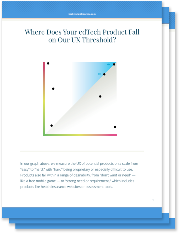
Where Does Your edTech Product Fall on the UX Threshold?

If you've ever tried to sign your child up for a PlayStation or Nintendo Switch account, you know how complicated digital experiences can be. When it comes to popular gaming sites, most tech-savvy parents are willing to put up with less-than-ideal UX just to make their children happy.

For every digital experience, there's a UX threshold. When the digital experience is so frustrating that the user no longer finds value in the product, the brand has pushed too aggressively against the limits of the UX threshold.

Some brands with particularly loyal users might be "lucky" enough to stop investing in better UX. But if a company has decided that its profitable threshold allows for a poor UX, do they have any obligation to improve? Beyond lost revenue, is there ever a moral obligation to make their products more user-friendly?

If you're designing edTech products, the point at which your user becomes frustrated or stymied by a complicated UX is even more important to gauge. After all, whether you're working for a nonprofit company or a well-established educational brand, good UX in edTech becomes an issue of access and equity.

Your users need products to pass a class, learn a critical skill, or pass a standardized test in order to attend college. What happens if a teacher experiences a high level of frustration when trying to use your product in the classroom? Or your user is a parent who isn't technologically savvy? Or an administrator desperately needs your technology to improve outcomes for their school?

Because the stakes are so much higher in our industry, we should be motivated to design tools that do more than meet our bottom line. And that means the UX for even the most complex learning tools needs to be as streamlined and accessible as possible.

Ditching Highly Proprietary Design Patterns: Reducing the UX Threshold for Complex Administrative Tasks

It might be easy to improve on bad UX, but making good UX great requires complex problem-solving from your UX team.

In edTech, the administrative aspects of learning products often have the most technical complexity. By leveraging common UX patterns, you'll lower your UX threshold and make your product something that meets teachers and students where they are.

Administrative complexity looks different depending on your primary user. For teachers, administrative complexity may involve setting up the software for the learning product, creating user profiles, rostering students, or managing multiple staff users. For administrators and IT professionals, it might mean navigating multiple screens, connecting to outside systems, or learning how to share data across platforms. And for parents, administrative complexity requires learning how to sign up their child as the product's primary user. It might also mean taking advantage of available learning outcomes data in order to make informed decisions about their child's education.

In order to lower the UX threshold for your product, leverage existing UX patterns that won't require users to learn a new, proprietary system or go to multiple places to accomplish a simple task. Lowering your UX threshold encourages your user to engage with the task at hand, which leads to higher completion rates within your product. It also helps shift the user's mindset from tense to relaxed. A tense user will tend to have a lower frustration threshold for completing tasks.

Even if you're using well-established UX patterns, there's plenty you can do to provide a fresh and delightful experience for your user. Micro copywriting, visual design, and other touches provide your experience with a unique look and feel without causing cognitive overload.

The more you can do to meet schools, teachers, and students where they are, the more relevant your designs will be. You'll create learning products that solve problems and integrate with a teacher's day-to-day technology. And you'll design tools that enhance and extend what administrators are already using — all without adding complexity for your users.

Leveraging Interactive Complexity to Help Students Learn

In edTech, designing a product with interactive complexity becomes even more important. We have an obligation to consider how to make interactive teaching moments rather than static ones. We must strive to work with subject matter experts to determine how to break a topic down, so students work with material in a rich way.

Most learning products demand a high level of interactive complexity from UX designers. Ideally, students are able to learn new concepts or skills as they move through an experience and interact with it. However, this level of interactivity adds to a product's UX complexity, and UX designers often remove interactivity from the moment of instruction or assessment — just when students need it most.

For example, a learning product with interactive science experiments might have two separate interfaces. In one interface, students are introduced to scientific concepts illustrated by the science experiments. In another, they might be encouraged to interact with the science experiment itself.

However, if you separate the interactive interface from the problem students are trying to solve, you'll wind up creating a higher barrier to learning. You'll design a cognitively disjointed experience, which isn't how students experience learning in the real world. Students will end up learning how to use your product — instead of learning a new concept.

While it may seem counter-intuitive, leveraging interactive complexity actually requires you to simplify the UX for your product and reduce its UX threshold. The more you simplify your UX, the more likely you are to make a product that showcases important concepts and engages the students who need your product to learn.

The ROI of Investing in Great UX by Reducing Your UX Threshold

Even if you're building a complex product, there's real ROI to investing in UX. Not only do you help teachers, administrators, and parents onboard and navigate your product quickly, but you also improve learning for students by connecting new concepts and skills to interactive UX.

Concrete design requires both the administrative and interactive parts of a product to work together in concert, even when they're individually complex. When you use an approach like concrete design, you make a product that's more likely to be bought or adopted. Teachers and students respond to a product that's easier and more fun to use, increasing overall engagement with your product.

You also reduce cognitive load within the product, which means less training time for teachers and less onboarding for students. While onboarding for any product is necessary, there are downsides to a long, drawn-out adoption process. If your onboarding strategy depends too heavily on textual explanations, for example, you introduce more barriers to students and teachers with learning differences.

When you reduce training and onboarding needs for your product, not only are you building a more equitable product, but you're also shifting resource allocation within your budget. Suddenly, you don't have to spend a large chunk of your project budget on designing onboarding tools. Instead, you're able to focus those resources on developing product features and creating outstanding visual design.

When you build a tool that's more intuitive to use, you directly impact your bottom line. Improving UX leads to more revenue streams as you widen your market and roll out a product that's more accessible and easier to use. When you give potential clients a demonstration of your intuitive product, your sales team has to do less explaining — and the product begins to sell itself.

Why the edTech Industry Should Care About Making Good UX Even Better

Like you, we care about designing intuitive edTech products that solve real problems and are adopted widely by schools and school districts. But we also recognize that the edTech industry has different users and goals than consumer tech.

The stakes for edTech products are much higher. Good UX can be the difference between a student learning a new concept and struggling to master it. It can also mean the difference between a product that all students can use and a product that excludes students with learning disabilities.

Because the stakes for our products are so high, we have a moral obligation to identify the point at which bad UX creates barriers to success — and push ourselves to make good UX even better.