All Posts in VP Digital Product Development

March 19, 2020 - No Comments!

Build Something Better: The Real Value of a Scalable Discovery Process

If your company has adopted Facebook's "move fast and break things" approach to product development, you may be used to sidelining user research in favor of learning through failure.

In Erika Hall's Just Enough Research, however, she suggests user research and learning through failure don't have to be at odds with one another. Instead, you can conduct just enough research to learn plenty of helpful information about your users and take big risks to roll products out quickly.

At Backpack, we embrace the user research process in the design discovery phase, but we also recognize that laying a strategic foundation for your product should be scalable. You can do as much or as little research as you want and still get a lot out of the process.

If you truly want to embrace human-centered design and make your head of marketing happy, here's what a targeted discovery process can do for you.

How Targeted UXR Eases Tensions Between Product and Marketing

Our clients are savvier than ever about targeted UX research, or UXR, and its value in product development. But we still run up against inherent tensions between product development and the business requirements of a product.

"Of course, we want to find out what our users want," this line of thinking goes, "but we also want them to buy this product." Companies aren't always equipped—or willing—to change direction based on the results of UX research.

The tension between product development and marketing might never go away. But the process of targeted UX research during the design discovery phase will shed light on your users and pay off in dividends. Even though you've signed up for early user experience deliverables like site maps, wireframes, and prototypes, you're really getting a deep dive into your user's pain points. UXR unlocks the potential of your product, impresses your key stakeholders, and helps you plan for future products.

Want vs. Need: The Immediate ROI of UXR

Early UXR is about more than uncovering a user's desired features. It's the moment you and your team discover what your users really need. What are your desired outcomes for each persona? What are their pain points? How can you meet your customers where they already are?

Using these questions to guide your UXR leads to human-centered design. You'll hone in on pain points associated with a user's day-to-day experience instead of addressing what you think your product might solve.

As you validate your assumptions through qualitative interviews with a handful of users, you'll uncover a narrative that makes existing user data more meaningful. In this way, UXR drives customer engagement once your product rolls out to market. It will affect your decision-making process for future product development, too.

In addition to the inherent value of understanding your users, there's big ROI for investing in this process early in the product planning phase. UXR gives your design team insight into the nuances of your market before they begin designing product features and workflow. Because of this, your designers will offer more targeted, innovative solutions that get to the heart of your user's primary challenges and create a more delightful UX.

Invest in Better Solutions for Your Target Market with Backpack's Scalable Discovery Process

As a specialized UX and design team with deep experience in edTech, Backpack has a unique approach to collecting and synthesizing data. When you invest in a better research process, you invest in better answers. What did your competitors do? What do analytics suggest are the best solutions for your users?

By developing targeted research into specific edTech personas, we shorten your development cycle. This provides you with more robust data than marketing or user testing baselines and helps you to minimize risk as you develop your product. We also recognize that you may not have time — or resources — to conduct in-depth UXR. That's why we've scaled our discovery process to include robust options for your timeline and budget.

Our scalable discovery process includes:

A competitive audit
We look at other products in the same space from a UX standpoint. What will your users expect from a product like yours?

How to scale it
In-depth: When you have more time for UXR and want to deepen your competitive audit, we'll take the time to review 10 direct competitors, as well as tangentially related products or companies. We look at product messaging, onboarding tactics, ease-of-use, analytics, speeds of site, feature offerings, as well as product look and feel.

Targeted: We can also develop a more narrow field with client direction and focus on two to three competitors. Even reviewing a short list of competitor links as a group helps product owners get in the right mindset during development.

A tech audit
We look at analytics and user flows for your existing product before moving forward with a redesign. What does your user data tell us about how to improve UX?

How to scale it
In-depth: We'll paint a vivid picture of user behavior by developing use cases, creating diagrams and flow charts, using heat map screens, and cross-referencing our findings with user engagement data.

Targeted: Clients also find value in reviewing sorted analytics to determine the top five user pain points. Where does your data indicate that users are falling off in the experience? What are the most important features to review? Are these features getting the right amount traffic?

An accessibility audit
We follow best practices around color contrasts, navigation, screen reader-friendly text, fonts, and audio/visual interfaces. How will making your product accessible give you more opportunities to reach new users or narrow the focus of your design direction?

How to scale it
In-depth: Depending on your needs, we'll bring in an accessibility expert for white glove service, including a meticulous review of site for feature optimization. This includes testing for color blindness and the overall contrast of your site for other visual impairments.

Targeted: We review the visual styles of a site, making sure they will pass accessibility tests. Are you following best practices from a front-end development standpoint?

User surveys
We ask users about competitive products and features. Where do you want to put your emphasis so you have a competitive advantage?

How to scale it
In-depth: We'll help you survey tens of thousands of users to ensure a 10% response rate. We design user surveys carefully in order to find significant correlations between demographics and behavioral attitudes or opinions. Cross-data correlations are always more significant when you have a bigger data set.

Targeted: We'll help you determine how many users you need to survey for your quantitative data to be statistically significant and develop a short survey of 10 questions. Even basic answers from users can give you actionable data in a short period of time.

Stakeholder discovery
We conduct in-depth qualitative research with your product stakeholders. By connecting this process to data, we show stakeholders the tangible value of discovery.

How to scale it:
In-depth: We'll coordinate discovery sessions with your internal stakeholders, including staff involved in content management, community engagement, sales, and marketing. We can also conduct external stakeholder interviews to determine the views of your primary persona, any resonant personas, and product buyers.

Targeted: We can also easily work with product owners and staff members who have the editorial vision for your products. To narrow your external discovery, we'll collect anecdotal evidence from relevant users. Even after chatting with just a few people who fit the parameters of your primary persona, we'll start to see patterns we can apply to your product design.

Taken together, this scalable design discovery phase creates a three-dimensional model of where you are right now in product development. With a robust model in place, we determine how best to apply our knowledge to your product design. Whether you have time to conduct in-depth UXR or need to narrow your field of inquiry to more targeted forms of research, you'll find out more about your users, their expectations, and their needs.

Case Study: How NSGRA Responded to a "Hidden" Pain Point through Discovery

Scholastic’s Next Step Guided Reading Assessment (NSGRA) software helps teachers determine student reading levels and develop targeted next steps in their instructional plans. As Backpack led discovery for the product's redesign, we were surprised by the findings of our user surveys — and used the results to better serve the needs of Scholastic's primary users.

Before its redesign, NSGRA recommended that teachers use the software three times per year to facilitate benchmark reading assessments. By asking questions about teacher technology and frequency of use, we discovered many teachers used the product much more often — about five times per year. Teachers used reports to group their classrooms by reading level throughout the year. They also depended on NSGRA's reporting during parent-teacher conferences to discuss individual student outcomes.

Because many teachers were generating assessment reports more frequently, the process for entering student assessment data needed to be easier for teachers to use. If we hadn't asked teachers about their technology use during initial discovery, we would have never uncovered this "hidden" opportunity. Armed with this new perspective, we were able to make more effective UX recommendations to Scholastic throughout the product's redesign. After all, whenever user behaviors don't match up with a product's technology, it's a chance to identify ways to simplify or improve product features.

Central to the redesigned experience is a new workflow for teachers to enter student assessment data. We created a parity with the offline assessment forms, facilitated quick data entry, and established clear visual indications of where the user was in the process. Teachers can now effortlessly personalize their instruction for learners needing additional attention. Administrators can also easily discover and address class-wide performance trends.

When "Just Enough" UXR Provides Sizable ROI

Whether you have room in your budget for a lengthy discovery process or targeted user research, scaling UXR to your needs pays off in dividends. You'll discover more about your user's pain points, deliver an experience that effectively solves their problems, and inform development for your future products, too.

Don't just "move fast and break things." Conduct just enough UXR to uncover meaningful insights about your users and take calculated risks that deliver bigger returns on your investments.


September 19, 2019 - No Comments!

How to Design the Best Data Dashboard in edTech

With more complex edTech tools comes an influx of student performance data and new standards for teaching and learning tools. While data can be an extremely powerful tool for educators, training teachers to use complicated edTech products can be cost prohibitive and inefficient for both software companies and school districts.

Even more complicated? Proving the efficacy of your edTech product in the classroom is on you — and if your users can't access or understand this data, too, they won't be convinced that your product offers a good solution.

Thankfully, you can reduce or eliminate many of these obstacles by designing better, more functional data dashboards. These design improvements will go a long way toward convincing your clients and their users that edTech tools help teachers do their jobs even more effectively.

The gap between edTech designers and their users was never more apparent to me than when I left SXSW EDU earlier this year, mulling over a lively panel on the topic of data-driven learning. When panelist Josh Dormont, the director of product development for the NYC Department of Education, revealed how hesitant teachers and teachers' unions have been to embrace data-driven teaching tools, I wasn't necessarily surprised. I understand the objections and fears teachers have about how data could potentially be weaponized by administrators or misinterpreted when reviewed out of context.

After all, an influx of data can be a powerful tool — or a source of anxiety for your users. That's why it's so important to make data dashboard design a priority as you plan your next edTech product. Here's what you can do to make it even easier for teachers, administrators, and parents to use robust, data-driven edTech tools:

What Makes an edTech Tool Effective?

New educational technology transforms learning in schools and homes, and it also generates tons of student performance data. In order to be successful, these new products must also enable teachers and administrators to easily track, monitor, and react to performance data. Otherwise, teachers are left drowning in data that isn't actionable, and they miss out on significant takeaways about their students' performance.

Each new edTech product is also judged by how effective it is. When considering a new edTech product, school administrators and other key stakeholders look for a few key measures of efficacy before they make an investment:

    • The product improves assessed learning outcomes, i.e., "hard" data. Straightforward, before-and-after data that shows how students have improved over time is the baseline for most buyer decisions. This is true even for products that have "softer" learning goals or outcomes, like those tied to social and emotional learning.


    • The product improves observed learning outcomes, i.e., "soft" data. In the crowded world of edTech solutions, positive observed outcomes have become a powerful differentiator for many products. Sure, the numbers show the product works, but what do real teachers say? These observations could be as complex as expert-driven testimonials or as simple as social reviews. Finding ways to track and display observed learning outcomes in meaningful data visualizations can be a powerful addition to your product's data dashboard.


  • The product demonstrates high engagement with users. How frequently the product is used, and for how long, matters a great deal to administrative stakeholders. These personas also consider which elements of a product users engage with. Are students only playing games? Are teachers actually using the product for its intended purpose? As you develop your data dashboard, be sure to make it easy for the right user to track and access the engagement data they need to determine whether the product is working for them.
  • It meets internal benchmarks of teacher satisfaction. If you build in simple systems for teachers to submit feedback about their experiences using your product, you can use this data to improve the next version of your product. Teacher satisfaction data is often a key indicator for administrators who make purchasing decisions for their district.

When you design with data visualization in mind, not only will you find more opportunities in the UX and UI to make your product more effective, but you'll also demonstrate to clients and their users that you truly understand the challenges they face in the classroom.

Well-designed data dashboards make it easier for students to track their progress, for teachers to assess student performance, and for administrators to make purchasing decisions. It's up to edTech designers to make these visualizations easy to understand and even more powerful to engage with.

Your Data Dashboard Designer Checklist

Well-designed data dashboards offer the simplest and most elegant solutions for user insights. In one place, users can see how their product or system is performing, whether that's within a single classroom or across an entire grade, school, or district.

Providing school administrators, teachers, and parents with robust, actionable tools for assessing student data is key to ensuring your edTech product will be utilized thoughtfully both in and out of the classroom. Students need their own data feedback systems, too, whether that's a series of prompts that encourages them to engage more deeply with your product or a dashboard that shows how their performance measures against the goals they've set for themselves.

After years of creating and testing data dashboards for each of these audiences, we've distilled our best practices for creating a killer data dashboard. Follow our Data Dashboard Designer Checklist to help educators make better, more informed decisions and take immediate action based on the data collected by your product.

September 3, 2019 - No Comments!

The Power of Simplicity: Making Learning Design for Everyone

From the sleek, pared-back sensibilities of Apple products to the broad appeal of human-centered design, there's power in designing digital products with elegance and simplicity. But embracing the goal of simplicity during the product planning process doesn't mean a product can't be complex, interesting, or enriching to use, too. Deeply elegant design solutions can also delight.

When it comes to building edTech products, it can be challenging to design a complex product with an elegant interface. You want to put your stamp on a product before it hits the market. You also want to give your customers a new and innovative tool that solves their problems in the classroom. The drive for complexity at this stage can encourage product teams to add layers of added instruction or content — when a simple interface often leads to a better experience for the user.

Great design is for everyone, and that rings especially true for teachers and students using edTech tools in the classroom.

Here's why you should embrace the goal of simplicity throughout your next project — and a roadmap for how to create a successful, transformative learning product built around the goal of simplicity:

The Value of Simplicity in edTech

As designers and developers know well, there's nothing "simple" about simplicity. In product design, "simplicity" comes from a deeper understanding of a product's larger goal. Even if you and your team already know what kind of edTech product you want to build, taking the time to refine the purpose of your product makes all the difference in the design and user experience.

For example, distilling the goal or purpose of your product will make it easier for you and your team to navigate the murky waters of determining a product's features. It's notoriously easy for UX and UI teams to get caught up in overly complex design by adding features. With a refined purpose in mind, however, you'll be able to cut, edit, and consolidate features, even as you tackle new and more sophisticated ways of designing how your product does what it's supposed to do.

By refining a solution through the lens of the product's larger purpose, design teams and UX developers can build a sleek, easy-to-use interface that teachers love to use and students are eager to engage with. Even if a product performs a complex action — like sorting student data or helping a student practice their reading skills — the design itself should be simple and accessible.

Simplicity is especially important in edTech products because it naturally makes design solutions more universal. Complexity and overwrought style often result in awkward design solutions or solutions that narrow your audience.

This poses a real problem for edTech consumers, in particular. Teachers may have little time to engage with a complex dashboard that's difficult to learn, for example. Because edTech products come into contact with users who have a wide range of abilities, they also need to meet benchmarks for inclusivity. One of the best ways to think about inclusivity in edTech design is through the lens of simplicity.

What Does Simplicity in edTech Look Like?

In edTech, we often have complex stories to tell and experiences to facilitate. Many edTech products — like reading tools for young learners or assessment tools for teachers and administrators — are robust systems that perform complex tasks.

Complexity is not the enemy of simplicity. We value presenting rich topic areas to students and giving teachers powerful tools for exploring and comparing student data. However, our goal is always to present this information in a way that feels simple and intuitive to the user, no matter how challenging the product was to build.

It's easy to design products that go too far in the opposite direction, too. Oversimplification can result in incomplete or boring experiences for students and leave teachers with tools that don't have the depth to achieve their goals.

So what does simplicity in edTech actually look like? Here's a quick guide:

  • Limited user options. Think hard about what goals a user wants to achieve, so you can decide which features a user needs to see; which features can be made available but remain 'closed;' and which features you can combine or eliminate.
  • Common design and interaction patterns. Simplicity is predictable. When you use common UI patterns, the user can guess how features function before they interact with them. This frees up their conscious mind to make more formal decisions or learn a new concept. This could be as simple as designing controls that look like toggle switches to allow a user to turn a feature on or off, for example, or using a magnifying glass icon to indicate the "search" function.
  • Clear benefits. Complicated products tend to confuse the user about the benefits of interacting with a product, or they make it difficult to determine what the goal of interaction should be. Make it easy for users to understand why they might want to tackle learning new consonant or vowel sounds. Help teachers understand how they can use the assessment data they're collecting to make actionable student learning plans.
  • Less interface. Think about the learning experience itself. Rather than present a video describing a physics principle followed by a series of multiple choice questions, for example, create an interactive model of an experiment that allows learners to "play" until they get it right. Find ways in your product design to embrace experiential learning or other pedagogically sound teaching methods.
  • Fewer instructions. When you bog a user down with instructions, they can get confused, frustrated, or scared off. The interface itself should encourage interaction. This includes letting users know how much more time it might take to complete a step in a longer process.

When you use these principles in edTech product design, the result is a learning or educational tool that's simple but robust, user-friendly, and accessible to many different kinds of users.

Case Study: How Simple Design Widened the Audience for Scholastic's Literacy Pro App

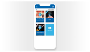
Literacy Pro is an independent reading app we created for Scholastic. Upon launching the app, learners gain immediate access to books through an eReader and can begin reading after just one click. We made this exciting — and easy to do — by including a single, dimensional object on the first screen: a book cover that invites students to click. It required a lot of iterations to arrive at this direct interaction, but our testing showed that this pattern was so simple that students didn't have to think about it.

Literacy Pro's purpose was to "develop a love of reading" — not to launch an eReader or to provide reading reports for teachers. It certainly does both of these things, but they are in service of the larger core purpose of the product. Keeping this purpose in mind helped us make tough decisions when it came time to set priorities or cut features.

By starting this project with a simple statement of purpose (and not the product's features or business requirements), we focused our work through the lens of simplicity to achieve the stated goal of the product.

The simplicity and elegance of our design led to students using Literacy Pro intuitively and well. In terms of visual design, Literacy Pro has a spare interface and a limited color palette. A system of visual icons allows users who are new to reading, or who may have reading impairments, to search for books by category. By eliminating instructions for how the search function works, the search interaction is as direct and simple as possible for the user.

While the design is simple, it's still colorful and has a personality. It's not sterile or boring. Even though the target grade level for the product was K-3, our testing showed that it appealed to students up to 6th grade. Simplicity, when done well, broadens the appeal of design and opens up your potential audience.

Simplicity & Accessibility Go Hand in Hand

Simplicity in design results in greater accessibility, and accessibility should be our goal, especially in an industry like edTech.

While there are specific standards for designing accessible products, solutions that are less cluttered, more direct, and more intuitive will be easier for people with visual impairments, dyslexia, and alternative learning styles to use.

You can apply our approach to accessible design to your work. It's all about the lens of simplicity:

  • Limited user options. Put fewer barriers between users and the rich educational content of an educational tool. Fewer options lessens the cognitive load required of a user and makes it easier for them to understand what to do. This also makes the interface easier for users with different learning abilities or visual impairments.
  • Bold, visual communication. Rather than depending on text-heavy instructions or complicated interfaces, think about how to present choices and information more visually, possibly through simple infographics or clear illustrations. This helps users with dyslexia and color blindness, or those who are visually impaired but not blind, take a visual shortcut to understanding a concept or what they should do next.
  • Fewer instructions. Few or no instructions means that an instructional product can transcend language, encouraging a wide range of users to engage intuitively with your product. This is particularly important when designing for early or pre-readers.

Designing with accessibility in mind is especially crucial for edTech UX and UI teams. Your products will wind up in the hands of many different kinds of users, including learners with different abilities. Simplicity is an added lens you can use to design elegant, accessible solutions that make your learning products tools everyone can use.

Case Study: Learning Ally's LINK App Shows Accessible Design At Its Best

The non-profit organization Learning Ally is the world’s largest provider of audio textbooks and literature. Their desktop and mobile app, called LINK, is an audiobook reader designed for students with dyslexia, as well as students who have learning disabilities or visual impairments.

Because Learning Ally's audiences often approach reading with fear or worry, the interface for their audiobook reader needed to be as simple and friendly as it is powerful. In addition to adhering to ADA best practices around color contrast and font sizes, we followed a philosophy of simplicity when creating the UX and UI design. As you can see, the color palette for this product is intentionally limited. Using fewer colors in more deliberate ways creates a simple experience for the user.

Text on every button is accompanied by an icon, and buttons are large, flat, and unadorned. This allows for a visual reinforcement of each button's purpose that doesn't require reading. We also eliminated additional instructions and how-to information, or, if necessary, we made it available only by clicking.

By leveraging existing interactive patterns, the UX for Learning Ally is also immediately familiar to users. Recognizable patterns make it easier for students to learn how the product works. Ultimately, familiar UX patterns are essential to any product design accessibility strategy.

Because of Learning Ally's attentiveness to the standards of accessible design, as well as our own benchmarks for simplicity and elegance, its UX has received multiple industry design awards. In 2018, Learning Ally was recognized in accessibility categories by Parent and Teacher Choice Awards, the SIIA CODiE Awards, and EdTech Digest’s Cool Tool Awards for its innovative, creative, and pedagogically sound approaches to reading.

Highly-accessible products for users with learning disabilities often present UX and UI teams with unique design challenges. By following ADA guidelines around accessibility, focusing on simple design, and leveraging familiar UX patterns, your team can create successful products that meet the needs of students who have a range of abilities.

While there's inherent value in designing edTech products for elegance and simplicity, the tangible benefits for your users make simplicity in design a win-win. Whether you're looking for ways to design a more satisfying learning experience for students or make your product design more accessible to users of different abilities, simplicity is key.

July 25, 2018 - No Comments!

Personalized Digital Rewards Are the Future of EdTech

“I’m missing basketball,” a student called out, interrupting our demonstration. I was with my design team at the Boys & Girls Club of Hudson County in Jersey City, N.J., piloting a web-based learning program called My.Future. Designed to bolster the beloved national organization’s after-school offerings in STEM and career-readiness, My.Future helps Boys & Girls Club members follow their passions, set goals, and earn badges for their accomplishments.

As you can tell from this student’s reaction, not everyone was on board with the learning tool. But once students had a chance to scroll through potential badges they could earn for computer science, leadership, and media making, the dynamic in the room changed. “What’s that?” asked the same student, pointing to a badge with glowing, golden headphones. “How do I get that?”

Well-designed digital badges and rewards, like the golden headphones from My.Future, engage students and their imaginations. But digital rewards in EdTech are most powerful when they’re used to help students set personalized learning goals. While I’ve long believed that educational products can harness digital reward systems to make self-directed learning more fun, our round of beta testing at the Boys & Girls Club confirmed what the research suggests. Combining learning incentives with self-directed learning makes digital education tools more effective.  

Giving students the opportunity to set learning goals makes education more fun, teaches students about the importance of persistence, and most importantly, improves student learning outcomes. In a recent study conducted by RAND Education and the Bill and Melinda Gates Foundation, for example, researchers found that personalized student learning improves outcomes, regardless of student ability. In other words, give students the opportunity to choose and track personal learning goals, and their outcomes in both math and reading will skyrocket.

When edTech software gamifies learning by offering students levels to conquer, points to accumulate, and badges to earn in pursuit of a goal, it gives students more opportunities to engage and delight in their education. Students report that they enjoy the learning process more when activities allow them to take an active role and engage directly with material. Higher engagement rates also make students more persistent when they encounter setbacks—helping them to develop more grit. Simply put, students work better and harder when they feel like an active participant in the classroom.

But edTech wasn’t first to figure this out—teachers were. Both project-driven learning and student-centered learning give students more autonomy in the classroom, allowing them to drive discussions, pursue their interests, and set meaningful goals. When teachers combine personalized instruction with incentive-driven in-class projects, they tend to see benefits like improved student motivation and better learning retention, too. Some research even suggests that teachers who prioritize goal-setting also experience fewer disciplinary problems, simply because their students are more engaged.

This is the research driving our most recent project for LIteracy Pro, a Scholastic reading tool that helps students choose their own books and set their own reading goals. Students swipe left or right on book covers, matching themselves to books that seem interesting. The software then offers a simple prompt: “How many minutes will you read each week?” Students can track how well they’re doing against their goal, perhaps even deciding to read more and more each night—ultimately blowing their goal out of the water without effort.

edTech can—and should—be designing more goal-driven software that helps teachers achieve learning outcomes, even as we continue to experiment with eye-catching, personalized rewards. There are a few products on the market that do this well—like DIY.org, Khan Academy, and offerings from Amplify—but we can do more as an industry to embrace and enhance what works in the classroom. And it would be relatively easy to implement, too. Digital products already designed to personalize a user’s experience can extend this idea further, rewarding learners when they achieve a goal. Rewards can be simple, like the ability to customize an avatar, “unlock” new content, or play a mini-game. Learners connect with what appeals to them most, deepening both engagement and delight.

Now, more than ever, it’s crucial for edTech to foster trust with educators by listening and responding to their concerns. In a recent Gallup survey, many educators expressed a reluctance to adopt technology in the classroom because they don’t believe edTech products meet student needs. But our industry has the capacity to design software that helps teachers meet national standards and drive student learning outcomes.

In my view, the most successful of these products will effectively combine self-motivation with personalized digital rewards — and harness all the positive outcomes that come along with increased student engagement. Personalized goal-setting software also offers compelling solutions for educators who need technology that adapts to learners with disabilities, or that scales effectively in the classroom. In fact, personalized digital rewards powered by student-driven goal-setting could be what finally wins teachers over.

It’s time to help teachers empower their students, and for students to engage and delight in their own learning. We already know that a badge with golden headphones can capture the attention of a reluctant learner—it’s what happens next that might at long last fulfill the promise of edTech.

This article was originally published in Crain's New York.