All Posts in

December 11, 2019 - No Comments!

Visual Design Strategy: How to Make Stunning edTech Products Users Will Love

Strong visual design strategy is crucial for creating an effective edTech product that engages your users and helps learners understand new concepts. The right visual design also helps adult learners develop new skills and teachers make better decisions about what's happening in their classrooms.

But the visual design process can be difficult for stakeholders in edTech to understand. Often the emphasis is on an edTech product's functionality instead of its visual design. That's why you'll see a lot of clunky interfaces that look more like the administrative back-end of a website.

If you want to ensure adoption and efficacy, it's crucial to aim for the polished UI of a high-end consumer product that delights users as they learn new content or practice new skills.

Want to know the secrets behind our award-winning visual design? We'll show you how we design lively, engaging, and sleek educational technology and give you the tools you need to make a case for investing in visual design strategy for your next digital product.

Who Are You Designing For? Balancing Design Elements Between Teacher and Student Personas

edTech products are used by multiple personas, each with incredibly different visual design needs and expectations. At Backpack, we juggle competing persona expectations by considering which elements of visual design personas might share.

For example, if the student-facing side of your product fails to engage users with visual design, it'll be difficult for your marketing team to sell teachers and administrators on the effectiveness of your product. And if the teacher-facing side of your product feels too juvenile, teachers won't think it's a valuable or appropriate tool for them to use, either.

We use the visual design process to uncover where design elements from the student-facing side of a product meets the teacher-facing side of a product. Because teachers rely on edTech tools for assessing classroom data, they require a robust interface. Our visual design can be friendlier, striking a balance between "welcoming" and "professional." By drawing on visual elements from the student-facing side of the product, we help teachers feel like they're using the same product — without feeling like we're "dumbing down" an important technical feature.

Ultimately, a product's visual style should be strategic and grow out of the research you conduct in the UX phase as you determine your target personas. Without an effective visual design strategy that appeases all of your users, your product might never leave the shelf.

Case Study: How Our Visual Design Strategy Helped Teachers Look Like Data Experts

Good visual design explains complex ideas and brings them into focus for teachers and learners alike. This principle is especially true in our visual design strategy for Scholastic's NSGRA, or the Next Step Guided Reading Assessment.
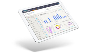
The NSGRA is a teacher- and administrator-facing product. Throughout the visual design process, we considered how to balance the technical needs of this persona with emotional appeals to an educator's professionalism and warmth.

While many of the basic colors used in the visual design for NSGRA are neutral and understated, the product also features bright, optimistic color accents that call the user's attention to key data and action items. These saturated colors are used sparingly and with great purpose, and the overall effect is professional and clear while remaining friendly and accessible.

The NSGRA doesn't feel like a kids' product, and our visual design incorporates these warm, inviting colors for a softer visual style than other products designed to collect and analyze student assessment data. Even the fonts we chose are rounded, which softens the "hard" nature of data visualization and makes the product feel more inviting to use.

If we had pursued a visual style that was too friendly or soft, however, we might have made it difficult for teachers to appear like experts in meetings with parents or administrators. The purpose of NSGRA is to provide teachers with robust assessment and reporting tools. Printouts or presentations of classroom data need to retain a high level of visual credibility, so teachers can use data in meetings with administrators or parents without worrying that the design looks juvenile or untrustworthy.

On the other hand, if we had designed a powerful digital data management tool like the NSGRA to focus on raw data fields and reports, the visual result could have intimidated new users and limited sales.

Through the process of identifying the teacher persona's needs and analyzing use cases, we were able to strike the right balance in our visual design strategy. The NSGRA gives teachers the right tools — and the right visual aids — to successfully present student data and make a case for better student outcomes.

Smart Visual Design for Students: Delight Instead of Drudgery

edTech designers are competing for students' attention with slick, consumer app interfaces and heavily illustrated, 3D-animated games that have high-end storytelling and use immersive technology. The bar for visual design in student-facing edTech products is just as high.

Even well-intentioned visual design for learners can inadvertently cue students into the fact that they'll be completing a boring task instead of embarking on an interesting learning experience.

If your visual design conveys to learners that they'll have a delightful, high-quality experience, your edTech product is far more likely to engage students, pull them in, and compel them to interact with your content.

Collaborative Planning: Using Commercial Appeal to Teach

Earlier this year, we were asked by the Scholastic National Partnerships team to help develop an immersive learning experience for LEGO that celebrated the 50th anniversary of the Lunar Landing in 1969.

The result is a highly visual set of activities that blends creative gameplay and real information about science. Users play an introductory game called "Assemble Your Team" that uses narrative to teach them about real careers in the sciences. They also collect stamps on a passport as they complete missions with real-world obstacles.

But none of these highly visual, interactive games would have been created without facilitating a collaborative visual design planning process. In just six weeks, our technology team was able to innovate right alongside our design team to eliminate technical obstacles and increase user engagement.

Through working meetings, we designed activities in concert with the tech team that accomplished LEGO's goals for user engagement and education — without letting a compressed timeframe get in the way of visual appeal or technical demands.

Because of time constraints, we couldn't build a user database on the back-end to save profiles of students beyond their session. But we still wanted students to have a fun, rewarding experience. So we designed a version of every possible outcome on the front-end and handed them off to our developers. This was only possible because we could brainstorm with developers and problem-solve together in real time.

Solving the Right Problems: How a Smart UX Planning Phase Sets Visual Designers Up for Success

As a UX firm with a strong background in visual design, Backpack's UX planning phase is a crucial part of our design process. This was especially true for our client Learning Ally as we designed the look and feel of their audiobook solution.
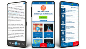
Learning Ally's audiobook solution app has three sections: a library of books to browse, a user community, and helpful resources and tools for struggling readers. During the planning process, we decided it was most important that users understand where they are within the app. We chose accent colors accordingly. The bright, orangey-red — only used once in our design — tells users whether they're in the library, community, or resource section of the app.

Our secondary bright color, a saturated green, highlights what we want users to do. It tells users what they can and should click on and where they can travel within the app. Everything else on the app screen is tonal. There's lots of blue, a Learning Ally brand color, as well as plenty of white space. More white space in design prevents cognitive overload in users, and it also draws attention to key accent colors and gives those colors more significance within the design.

Every design decision we made followed through on the strategic process of the UX planning phase. By building clickable prototypes for the app, we helped project stakeholders understand visual placement and functionality of its features. Once we began the visual design process, we had an excellent understanding of what the user's journey through the audiobook app would look and feel like. This meant we could design an interface that delivered on that experience.

Align Your Visual and UX Design for a More Powerful edTech Product

High-end design doesn't have to be a budget-breaker in edTech. Visual design is a strategic aspect of product planning, and successful edTech designers tie visual elements into the learning goals of each product.

When visual designers are cued into the needs of the UX team or front-end developers, you also create opportunities for creative problem solving that results in better customer engagement — and a stronger marketing platform down the line.

Companies that allocate resources for high-quality visual design from the beginning of the product planning process are more likely to design successful learning tools that test well with users. After all, if your sales team doesn't have to explain the visual appeal of a product, your product automatically generates trust and excitement — just by looking great.

December 3, 2019 - No Comments!

EdTech Product Design: How Smart UX Saves $$ on Technology & Creates Efficiencies

We know that adding a UX or UI team into the mix at your company can be scary, even if you have lots of experience facilitating communication between developers and visual designers.

There's always the risk that your company's vision won't be articulated the way you want it to be. Sometimes it's even difficult to see where you went wrong until you're at the end of the process. By that point, however, you might have already run through your budget.

As costs add up, don't make the mistake of short-changing your UX team. It's tempting to save your budget for expensive elements like visual design and development. After all, the most common output tools of UX, like sitemaps and wireframes, are cheap and fast to build. But they also represent a culmination of your team's thinking, and that's a process worth investing in.

Below, we break down why failing to invest in UX can cost you in the long run — and which product planning tools can help you save on your bottom line.

The Case for Investing in a Strategy-Oriented UX Team

The more time and effort you put into developing UX, the more money your team will save in the long run. The strategy process includes developing detailed wireframes, prototype design, and user testing. These powerful tools help you build a better product and refine your goals.

But we know it's not always easy to convince your boss's boss that this process takes considerable time and investment. Here's how you can make a concrete case for investing in a strategy-oriented UX team:

  • Underinvestment never pays. Failing to invest in the product planning phase often results in bringing a less sophisticated product to market. Especially in edTech, learners expect slick, engaging products that take time and money to develop. An underdeveloped product leaves you at risk of getting clobbered by the competition.

  • Product planning results in fewer reworks. When you invest in UX strategy during the planning process, you're less likely to redesign product features in the future. Everyone on your team should understand what your product's key features are and how they support your product's overarching goals.

  • Projects with forward momentum keep your own team invested. Multiple reworks can demoralize your team and make them feel less invested in a product. Keep your team invested in the product's success by generating buy-in on your product's goals and features early in the planning process.

  • Detailed wireframes and interactive flows educate stakeholders. With the right tools, stakeholders can become even more sophisticated consumers of product strategy. Wireframes illustrate UX strategy in a tangible way, and interactive flows provide a top-level view of how personas move through your product. This key part of the planning process helps everyone in the room make better, stronger, more informed decisions.

4 edTech Product Planning Tools That Will Save You Money on UX

In addition to saving money on technology costs in the long run, product planning results in more powerful, engaging, and pedagogically sound edTech tools. Here are four product planning tools you can use to build a better edTech product from the get-go:

  1. Detailed user journeys

    Traditional UX research results in user journeys that detail a specific persona and how they think about completing tasks within your product. These user journeys map out a persona's mindset, their goals, and why their goals might differ from those of another persona.

    Spending the time on UX research and user journeys pays off — especially in an industry like edTech. edTech products require a specialist's insight into how students and teachers navigate software, as well as how they will use your learning tool in a school environment.

    For example, students often use Chromebooks to complete school projects, which will affect your product design. Or teachers might use your tools to complete real-time assessments, which means they'll need an interface that's fast and easy to use.

    The more user research you build into your product planning phase, the more detailed your user journeys — and your team's understanding of their varied environments — will be.


  2. Annotated wireframes

    Developers are great at thinking through what a design decision might mean for a user two clicks away in your product. Or they might see an opportunity to accomplish a task in a way that's more delightful for your user.

    Incorporate developer feedback into the design process by using tools like annotated wireframes. Annotated wireframes deliver developer questions on every screen or user flow, facilitating more interaction between UX and development teams early in the process.

    Use internal communication tools in an app like Marvel, which helps teams share product designs, prototypes, and product overlays, to encourage more conversation. In Zeplin App, your team can even move sketch files onto a shared workspace so developers have the ability to make notes.

    By facilitating collaboration early in the process, your team will figure out where the holes in your design are — and how to address them without expensive reworks.


  3. Interactive wireframes before the prototype phase

    Interactive wireframes create proof of concept and generate internal buy-in with your stakeholders. They're cheaper than trying to build a prototype from scratch, and they're more effective visual demonstrations of product design than a verbal or 2D presentation.

    If you're excited about your visual design and UX, consider using interactive wireframes to get your stakeholders on the same page as early as possible. This will make it even easier for you to move to the prototyping and testing phases without encountering unexpected pushback on design or product features.


  4. Robust project management software

    Billable hours rack up when design teams have to hunt for project details, scope, or company design assets. Eliminate confusing back-and-forths with robust project management software like Asana or Trello. Use these tools to give your design team easy access to all the pieces of the project they need, like logos and brand palettes, without eating into your work day.

The best way to protect your bottom line is to use robust tools that reflect the most recent iterations of your UX strategy. This helps your UX team communicate more directly and effectively with developers and keeps all of your stakeholders on the same page. By investing in the planning process, you'll also have more time to uncover unexpected, well-designed solutions that will delight your users every time they log in. And you can't put a price tag on that.

October 1, 2019 - No Comments!

The edTech Designer’s Creativity Toolkit: Deep Listening

"Deep listening" is a process of engaged inquiry and openness crucial to design work. When you truly listen to clients — including everything they're not saying — you'll find yourself asking better questions and reading between the lines as you move through the design process.

Without embracing deep listening early in the product planning process, you might struggle to refine your edTech product, add too many design features that confuse your users, or roll out a product that lacks a sound pedagogical basis.

With all your deep listening cylinders firing, however, your road from concept to beta testing will be much smoother — and your users will delight in the simple, elegant solution you've designed.

Keeping this in mind, here's how to approach deep listening in your own product planning meetings:

    • Hear everything. You'll generate dozens of details about your product, and it's a design team's job to listen closely to your goals. Designers need to understand what your edTech product should do and what your users need to accomplish or learn. Your design team often provides the fresh perspective you need to unlock or refine the purpose of your product.
    • Ask the right questions. Whether you need to get into the mindset of your users or simply unpack your product's goal, it's important that your design team asks the questions that showcase the learning experience your product will provide students. Knowing the right questions to ask will likely stem from your design team's years of experience in education and product design.
    • Stay open to unexpected solutions. Just because a design team has already built a similar product doesn't mean they already have the best solution at hand. Stay open-minded to alternative designs, so you can hit on the best solution for your users.

When you stay open and curious throughout the design process, you'll generate more helpful information: better questions, more nuanced solutions, and more effective learning tools that get to the heart of your product and the users who will adopt it in the classroom.

Ultimately, the deliberate process of deep listening is designed to help you make decisions that will better serve all of your users, from the administrators who make purchasing decisions to the students trying to bolster their reading skills.

Case Study: Get to the Heart of Your Users with Design-Thinking Workshops and Deep Listening

Design-thinking workshops are important opportunities to practice deep listening at the early stages of the design process. If you're still discovering your user personas and designing their pathways through your product, deep listening can help you get to the heart of what your users value and how they'll engage with your product.

For example, in a design-thinking workshop for Hats & Ladders, an edTech company with an innovative mobile career education platform, we focused intently on who the app's users were and how each of their personas experienced the app.

Through the process of deep listening, it became apparent how each of their user personas approach the app's content differently. An "unmotivated" student might not take the same pathway as an "overachiever," for example, while an "undecided" student might take yet another pathway to uncover the career that's right for them.

By listening to how the client framed who their users were, we were able to develop strong user stories and user pathways. It mattered how we asked questions — and how we listened to the client's answers.

Ultimately, this process resulted in a completely restructured app that appealed more strongly to high school users. We made building a user's profile central to the experience of playing the in-app game. This allows teens to engage with the app's content while explaining their identity in meaningful ways to other users — and to themselves.

Without staying open-minded throughout this process of deep listening and inquiry, we wouldn't have uncovered such meaningful information about Hats & Ladders's user personas.

And without thinking at length about their high school users in particular, we wouldn't have hit on a design solution that appealed so strongly to teens or broadened the audience for the app.

More often than not, deep listening results in more informed — and more effective — product design.

How Deep Listening Leads to Better edTech Design

Asking the right questions — and listening deeply to the answers — is all about discarding your assumptions. Be open to thinking through why certain design decisions are being made, how these decisions apply to each of your users, and how the end results might be different than what you thought at the beginning of the process.

If you're leading product planning meetings, consider making openness your primary goal. Open-ended questions help you stay mindful of any baggage you might be bringing from your last project, while listening deeply to answers from your team will help you stay open to the unique challenges of a new project as you uncover its personality.

Every edTech product is different, but I have a simple set of open-ended questions in my designer toolkit that I return to again and again throughout the product planning process. These questions will help you throughout your design process, too.

Here are three questions that help me listen more deeply:

  1. How much interaction will your user need in order to engage with your product? This question gets to the heart of how different user personas are in edTech, as well as the assumptions you and your team might be making about these personas. For example, students might be sophisticated users of design, but teachers aren't always as comfortable or well-versed. It's also important to understand the different needs of your users. Where are they using the product? How much time do they have to spend on it? How much familiarity will they have with a product like yours? What are their pain points, and what are their expectations? How do you explain something visually to each of these users? These early decisions in the design process profoundly shape the experience of your user, which is why it's so important to ask open-ended questions and listen deeply to the answers.
  2. How do we avoid visual overload to make the product easy to use? This question helps design teams unpack which features are necessary and which can be simplified for ease of use. After all, edTech users don't have a lot of time. If your product can't be used quickly and intuitively, then it won't get used at all. The learning or administrative experience also has to be beneficial for your product to be successful. Sometimes, visual complexity can get in the way of that goal. Without posing this question at the beginning of the design process, you might lose sight of this goal as you introduce exciting new features for your user.
  3. How do we organize content in a rich, meaningful way? This question helps design teams tap into the pedagogical goals of your product. Remember: edTech products are unique. In order to be successful, they need to lead students through a meaningful learning experience or help administrators do their jobs more effectively and with a more robust set of tools. How you organize your content should reflect the depth of these user experiences without introducing too many barriers, over-complicating your user interface, or causing information overload.

Remember to take the time to reflect on what you heard and put it through the filter of your expertise. The decisions you make in early planning affect the organization of your product later on, and it's crucial that you and your team understand the big picture right out of the gate.

Openness coupled with "deep listening" will help you discover exactly what your edTech product should look and feel like. You'll likely go back to these questions again and again as you refine your user personas and the goal of your product in order to give your users the best possible learning experience.

September 26, 2019 - No Comments!

How Intuitive Onboarding Can Replace Costly Teacher PD & Support

Onboarding systems — which help users understand how to navigate your product — can be the difference between success or failure, especially in edTech. These systems require plenty of up-front investment in research, planning, and testing, but getting your onboarding system right during the design process gives you immediate ROI.

How do I know? Whenever I'm designing software intended to make it easier for teachers to teach and students to learn, I think of my first-ever experience using TurboTax software. When I was 25, I left my full-time job designing interactive prototypes for Bell Labs and started freelancing out of my apartment in Hoboken. I freelanced for about a year before going back to work full-time for the kid's media company that fostered my early interest in creating better educational experiences with technology.

When it came time to do my taxes, I bought a copy of TurboTax and jumped right in. I confidently skipped the "tour" offered by the software and started powering through easy questions about my general information and income. A few hours later, I found myself tangled up in a mess of itemized deductions, hardware depreciation calculations, and profit and loss statements. I eventually gave up and took a messy stack of notes and receipts to an accountant recommended by a colleague.

I'm still not sure whether I goofed by skipping the tour or TurboTax made it too easy to jump head-first into a complicated process. If I had let Turbotax show me how to use the software, I might have:

  • Used the software more effectively
  • Felt less frustrated and possibly even enjoyed the experience
  • Not given up and stopped using the software altogether
  • Avoided hiring an expensive consultant to help me accomplish my goal
  • Told other colleagues about the product

Here's how to navigate the onboarding process in your own edTech product — and how getting it right saves you money in the long run.

edTech Products: What Onboarding Looks Like

There are a few different onboarding systems that help a new user understand how to use your product. Each onboarding system has different advantages, and edTech products often make use of more than one type in each product:

  • Virtual tours: Users click through a slide deck that provides an overview of the product and its features. This is the most passive form of onboarding, but it's still effective. However, if your product is complex, a virtual tour involves a lot of reading for the user. This can slow them down or make the product less accessible.
  • Coaching: Users follow instructions within the context of the software to better understand features as they are encountered. This is also called "just-in-time help."
  • Guided task completion: Users complete an interaction within your product as they're learning how to use it, i.e., "First you'll create a new class." This onboarding system leverages what we know about experiential learning, which is one of the best ways to teach people how to do new things.
  • Progressive onboarding: Users receive instructions about how to get through the first level of interaction in your product. The product then encourages deeper engagement over time. One of the advantages of this onboarding system is that users don't have to immediately use the full toolset to have a meaningful interaction with your product.

Your edTech product will probably use one or more of these systems to familiarize users with product features and help them get the most out of your learning tool. Hitting on the right onboarding strategy makes users happier, more engaged, and more likely to recommend your product — giving you immediate ROI.

The Immediate ROI of Getting the Onboarding Process Right

edTech products need to be easy for learners to adopt, effective for teachers to use in the classroom, and successful tools for administrators to invest in.

Choosing the right onboarding system makes it easy for each of your users to engage effectively with your product, whether that's using basic features as you intended or exploring the product's advanced features to get the most out of what your product offers.

When users feel empowered by a product, they become excited about its value, recommend the product to other people, use the product more effectively, and engage with the product more deeply.

After all, user engagement is the make-or-break point for every edTech product on the market. Designing a more successful onboarding process ensures ease-of-use for every persona that will encounter your product — and encourages deeper engagement from your users, too.

Here's how getting onboarding right will add immediate value to your next project:

1. Purchasers reduce their administrative costs and other burdens to use.

As edTech product developers create more complex products, parent companies have started sending software coaches to schools for expensive professional development and product onboarding sessions. By only offering in-person coaching or software support, edTech companies create inefficient and expensive onboarding processes that negatively affect their own bottom line, as well as the budgets of school districts that adopt their new software. Onboarding problems also compound when schools buy the product, or when IT departments don't implement correctly — issues that can be headed off at the pass with more effective onboarding.

While product designers might not be able to replace in-person coaches altogether, we can make the job of product owners easier. By designing the right onboarding system within your software from the get-go, you can shift your professional development resources toward webinars or other online materials that are more cost-effective for your company — and for your users.

2. Teachers engage with more meaningful professional development resources.

edTech products become more meaningful to educators when the value of the product is explained clearly and effectively within the product itself. Onboarding systems provide a great opportunity to explain this value by creating a desire for your users to engage with onboarding instead of skipping or dismissing it. Teachers want to know why your product will help them teach more effectively. They're interested in direct and actionable resources, like teaching demonstrations, that will help them understand and unlock the product's potential.

By creating a rich archive of techniques and resources that demonstrates you understand the nuances of teacher personas, you help teachers with their professional development in a meaningful way. At the same time, you decrease potential barriers to use for these personas, too. Ease of use will always be key to your product's ultimate success.

3. Users experience fewer problems and have ways to report feedback.

Analytics for your onboarding system will help you see where users encounter problems throughout the product. Testing helps unpack what you see in analytics, and you'll have more opportunities to revise and fix the feature with the help of your design team — or evolve the way you've chosen to onboard that feature altogether.

A "just-in-time" training prompt or a mini tour might address an issue for most users, while the presence of an onboarding prompt will give other users important cues that feedback systems exist within your software. After all, most users want to know how to use a product and what they can do if they have a problem. Choosing — and testing — the right onboarding system will provide your design team with more opportunities to uncover and build these feedback systems into your product.

4. Purchasers feel you understand their training and implementation pain points.

So much of product onboarding can happen successfully within an edTech product team — rather than with the sales team at the end of your funnel. When you hire a design team that understands how a school adopts a product, the onboarding process improves incrementally as you move down your sales funnel. This adds immediate value to your purchaser, who benefits from an easy-to-use onboarding system, excellent professional development resources, and increased savings for their district or school.

By making onboarding a priority throughout the design process, you provide crucial product support to the busy teachers and curious students who will encounter your edTech product. Whether you incorporate progressive onboarding, guided task completion, or other onboarding strategies into your product, finding the right tool through iteration and testing will only add to your bottom line — and establish your firm's user-friendly reputation in an ever-crowded field of competitors